-
How To: Create map animations of raster data series with ArcGIS Pro
A step by step explanation on how to create a map animation based on a series of raster data in ArcGIS Pro,
-
How To: Create Small Multiples Maps with ArcGIS Pro (and InDesign)
In this tutorial I explain step by step how to create a small multiples map of temperature changes over time in ArcGIS Pro and InDesign
-
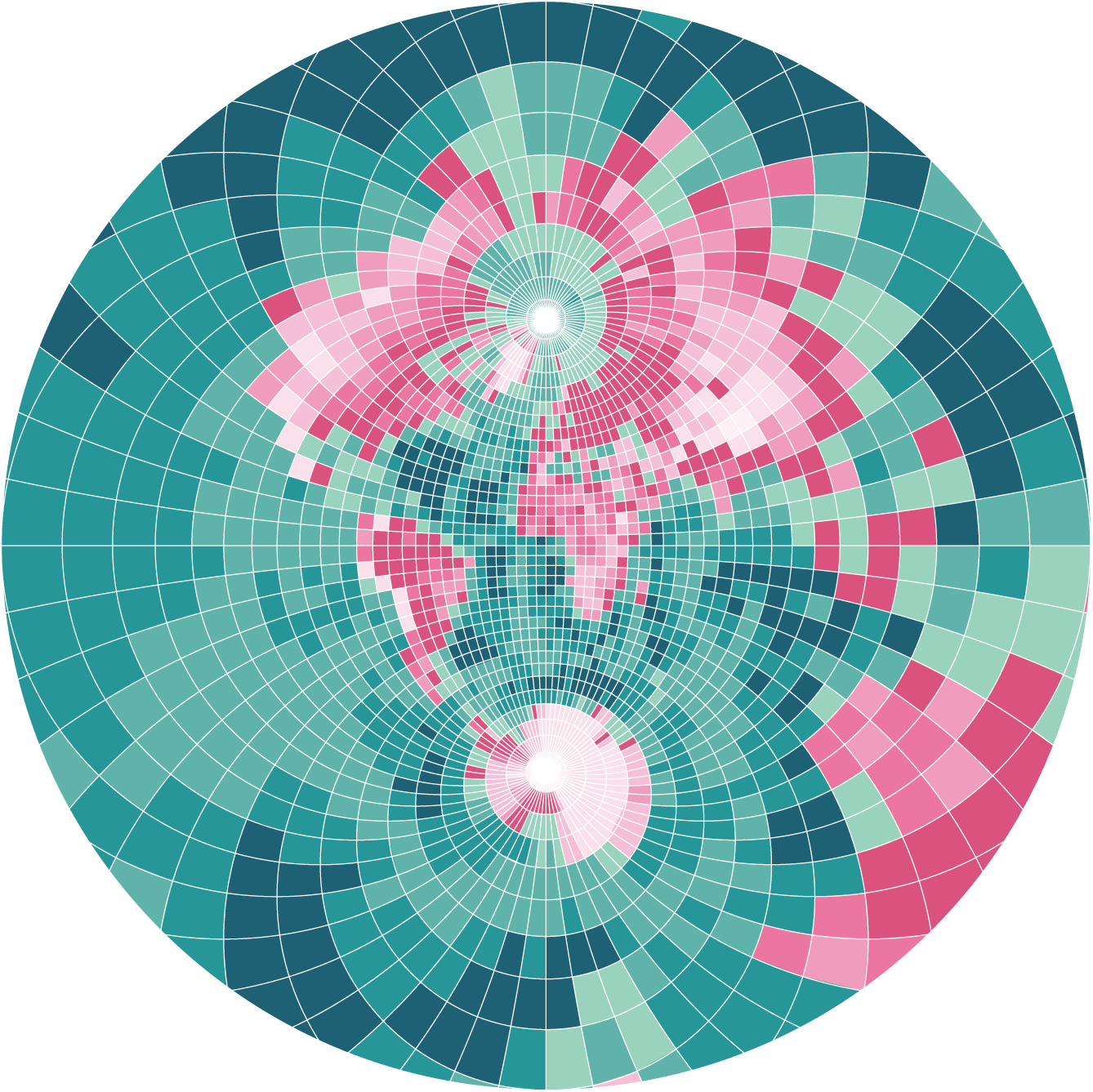
How To: Create Pixel Maps
In this tutorial I will explain how to create pixel maps. Besides their aesthetics, they are a great way to visualize distortions in map projections. Similar to Tissot’s Indicatrix, the variance in the pixel’s geometry show what would be same size on the Earth’s surface. My method to create these maps is based on raster…
-
#30DayMapChallenge 2021
A repository of my contributions to the #30DayMapChallenge 2021. Data sources, tools and background information.
-
Master’s Thesis: Map Animation Videos
Objectives Despite continuous improvements, the possibilities for creating cartographic animations in GIS software are limited compared to dedicated animation tools. The software Adobe After Effects is considered an industry leader when it comes to motion graphics, visual effects and the creation of professional animations. This thesis aimed to combine the value and power of spatial…
-
Principles of Geovisualization in Map Animations
This short scientific essay was written for the course Principles of geovisualization in my third semester of CDE. Characteristics of map animations The process of translating a spatial dataset into a visualization results in a so-called map, and the possibilities and available methods for this are manifold. In cases of handling extremely large datasets, or…
-
Choropleth Maps on the population of the Czech Republic
This set of maps was created in the course Thematic Cartography in my third semester of CDE. For this assignment, a number of thematic choropleth maps were created that show key figures of the population in the Czech Republic. The four maps show different methods how statistical data can be visualized and presented. Map 1:…
-
Internship at eoVision
In the lecture-free period between the second and third semester of CDE I pursued the mandatory 8-week internship. The company I chose is eoVision. It is located in Salzburg and is working on creating and publishing products like books, atlases, maps or calendars using geodata and especially remotely sensed image products. Apart from that, the…
-
Web Flow Map of bicycle sharing data
This map was created in the course Geovisualization and Advanced Cartography in the first semester of CDE. This project deals with the visualisation of bike sharing data from BLUEbikes in Boston, Massachussets. BLUEbikes provides rich system data for free use on their website. The flow of BLUEbikes users renting a bike at one station and…
nellomaps
Cartography and Geovisualization Design
