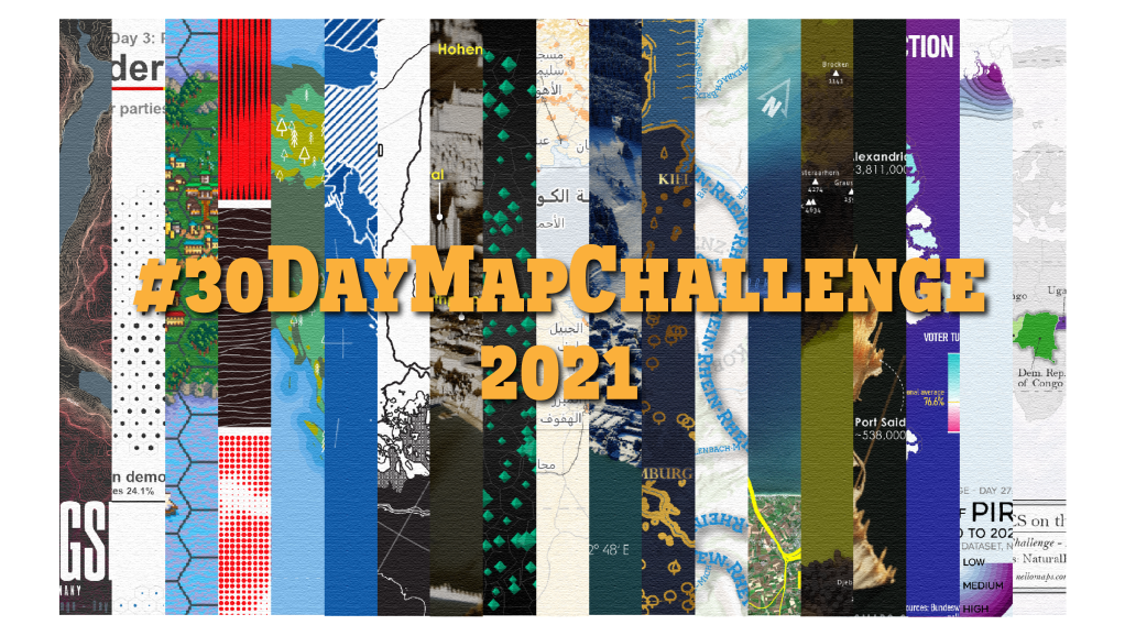
What does a jobless cartographer do? Make maps! This year’s #30DayMapChallenge by Topi Tjukanov came just at the right time while I was waiting for my first post-graduation job to begin. After watching the challenge in 2019 and 2020 enthusiastically as a spectator, I started preparing the maps just as this year’s topic got announced in the beginning of October 2021.
For some maps I worked a whole day, for others just one hour. The maps aren’t perfect, some have obvious flaws, but the time limitation is part of the challenge. In general, I am not a fan of quick and dirty maps, and while this challenge is tempting (or even intended) to make maps just like that, I’ve instead decided to skip some challenge days to improve other maps or when I wasn’t feeling comfortable to publish what I achieved that day.
Participating in this challenge really helped me to learn about different parts and aspects of our world. It let me try new mapping methods and tools and helped to convince/proof to myself (and maybe others) of my cartographic skillset in the sense of a portfolio. Finally, the encouragement and appreciation from the mapping community on Twitter immediately after posting a map was just overwhelming and definitely the best aspect of this challenge. I am happy to have become and to remain a part of this community!
Here you can find the official list of daily mapping topics, and here is my Twitter profile, where I posted my map creations.
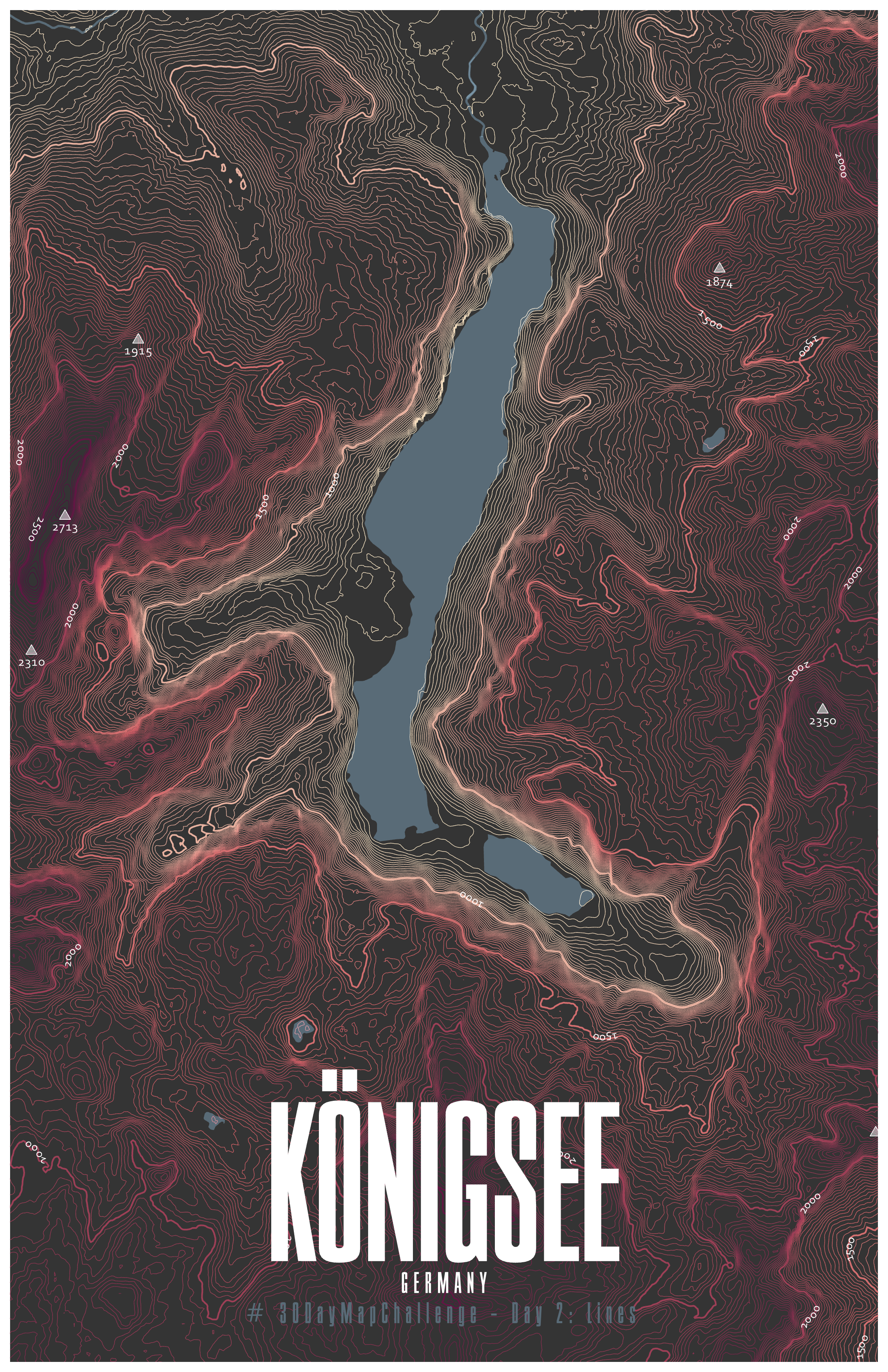
Day 2: Lines
After a terrific start of this challenge (by skipping day one 😅), I published my first map.
Aside from flow maps, my favorite type of lines in cartography are contour lines. I chose to depict the landscape around lake Königsee in Germany because its surrounding steep mountain slopes create unique and interesting looking terrain.
Tool: ArcGIS Pro
Data source: Federal Agency for Cartography and Geodesy – DLM250
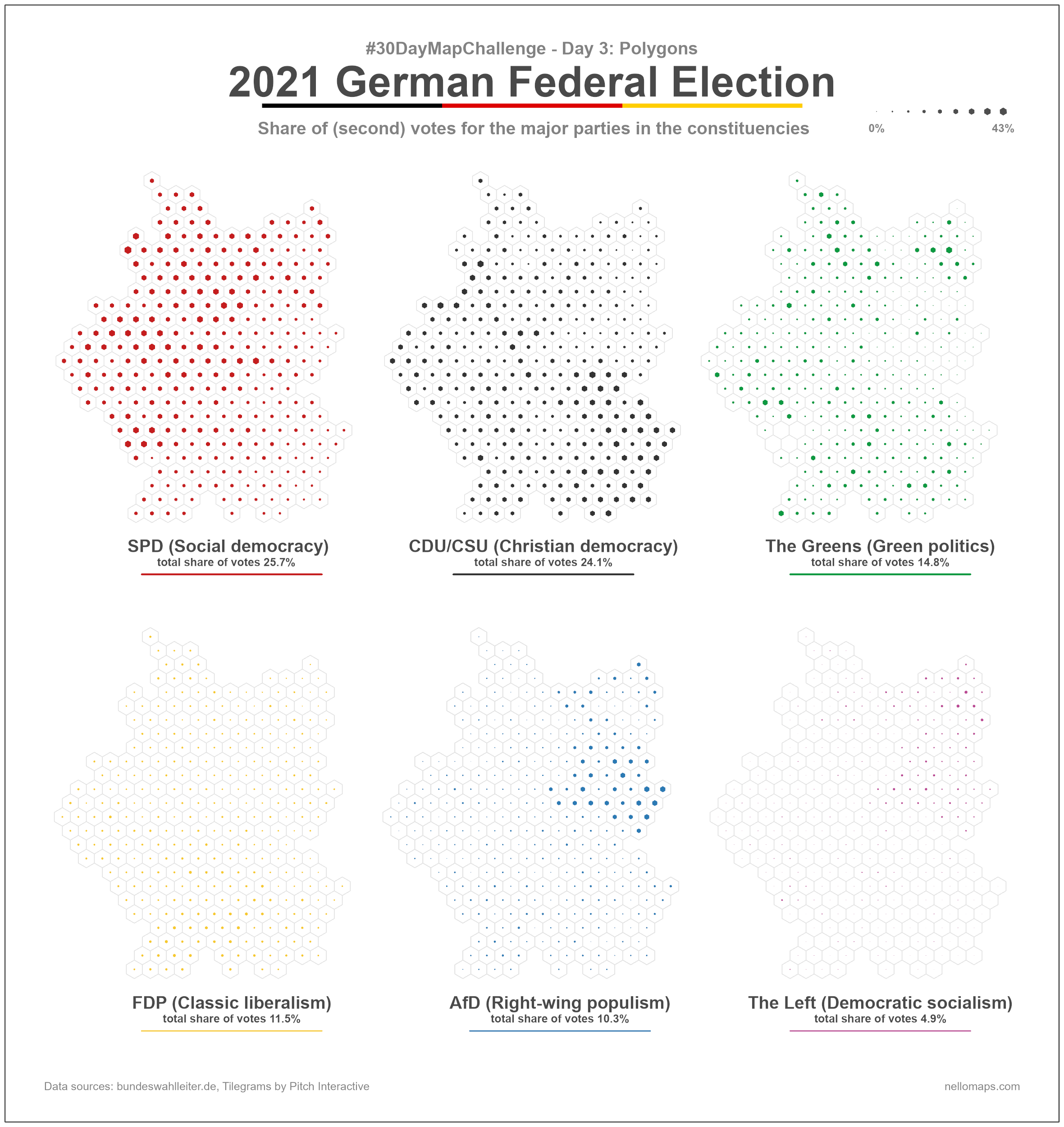
Day 3: Polygons
Regular hexagons simply have a satisfactory aesthetic and were therefore my first choice when it came to “polygons”. After I became aware of the website Tilegrams some time ago, and the constituencies of Germany were available as a data set, the choice of the recent federal election in Germany as a topic for this map was obvious.
Tools: Tilegrams, QGIS, QGIS Shape Tools Plugin
Data sources: Tilegrams, Bundeswahlleiter.de
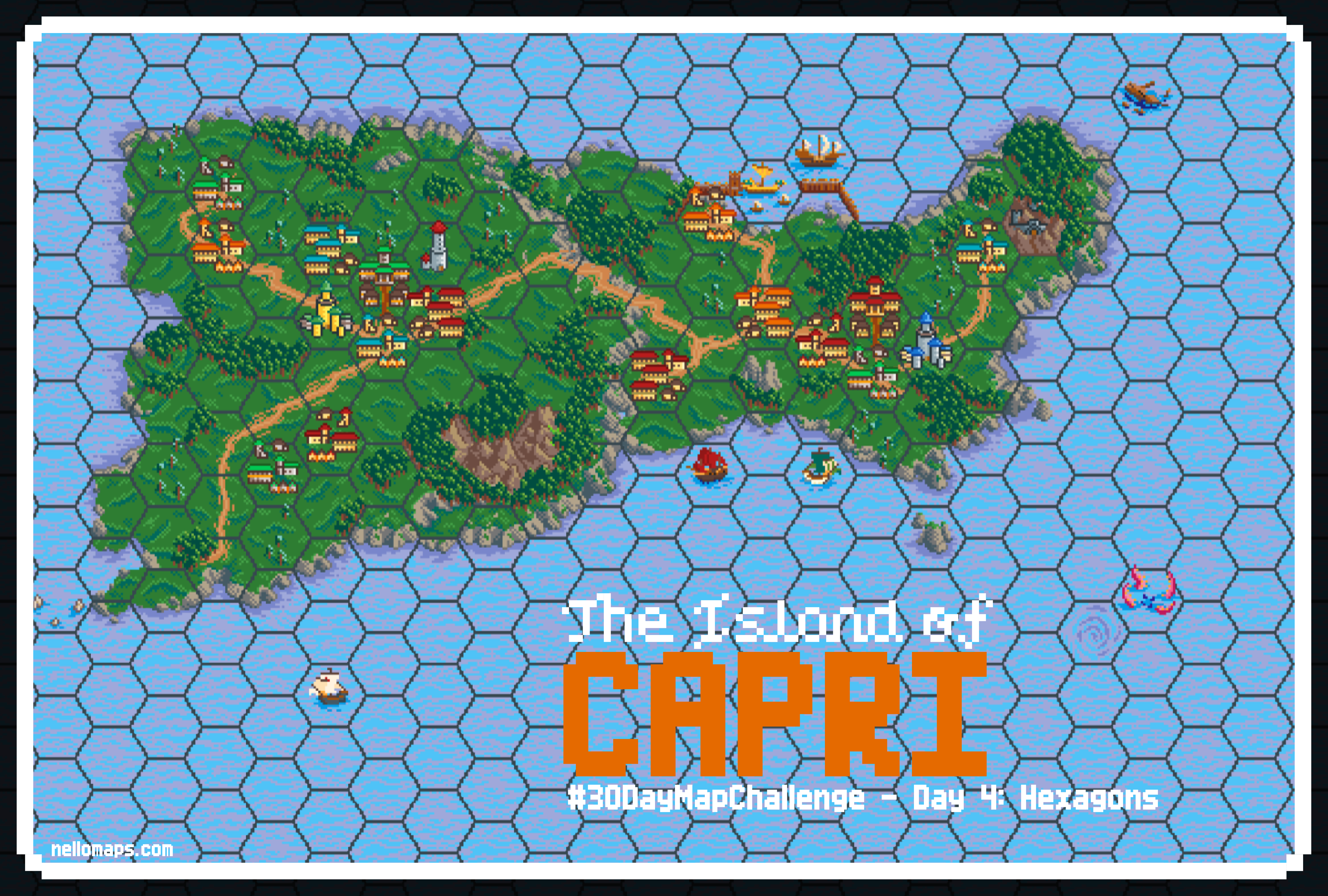
Day 4: Hexagons
The look of hex maps from video games was the first association when I first read todays topic. After a little bit of research, I found a beautifully designed set of hex tiles in a pixel style and decided to use it. In addition, I found a neat tool called Hex Kit to build hex maps. Lastly, I just searched for a random small island to map and decided on the Italian island of Capri. For the mapping process I used Google Maps as a reference and manually placed the tiles in the Hex Kit application.
Tools: Hex Kit, Pixel Hex Tileset 1 & 2, Adobe Illustrator
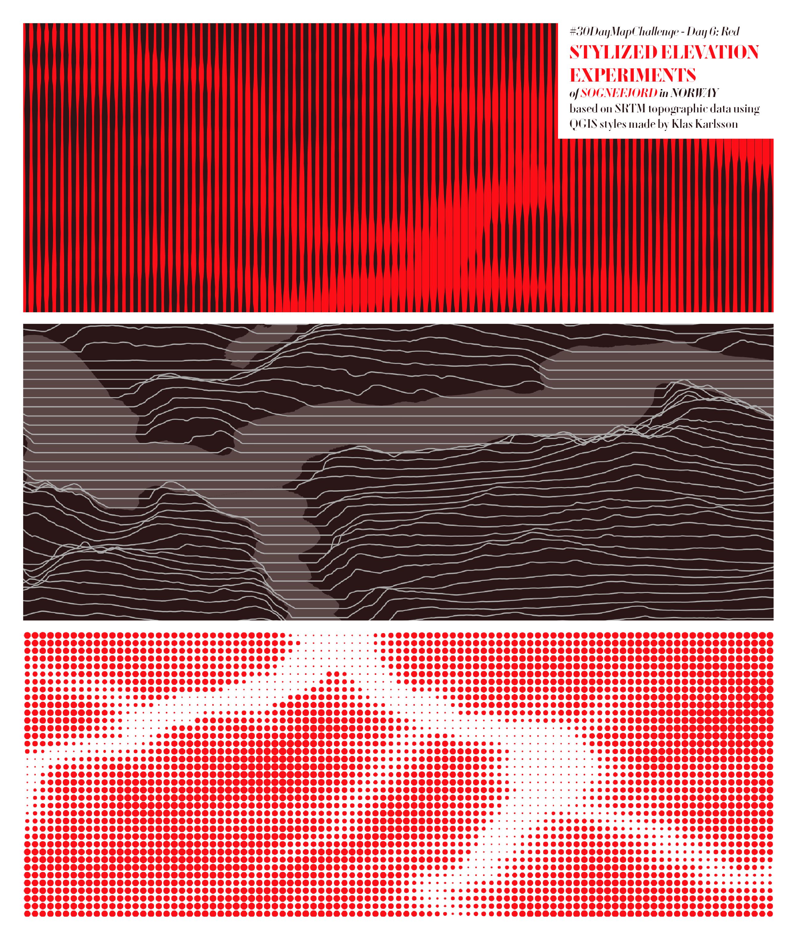
Day 6: Red
While browsing Twitter I found a post of @klaskarlsson in which he presented a few screenshots of his QGIS styles to symbolize elevation in a unique way. I simply used a red colour palette for the resulting map designs to justify the results of my experiments for today’s challenge “red”.
Tools: QIS, QGIS styles (Violin Elevation Lines, Halftone Elevation Lines, JoyDivision Lines)
Data source: SRTM 30m from OpenTopography
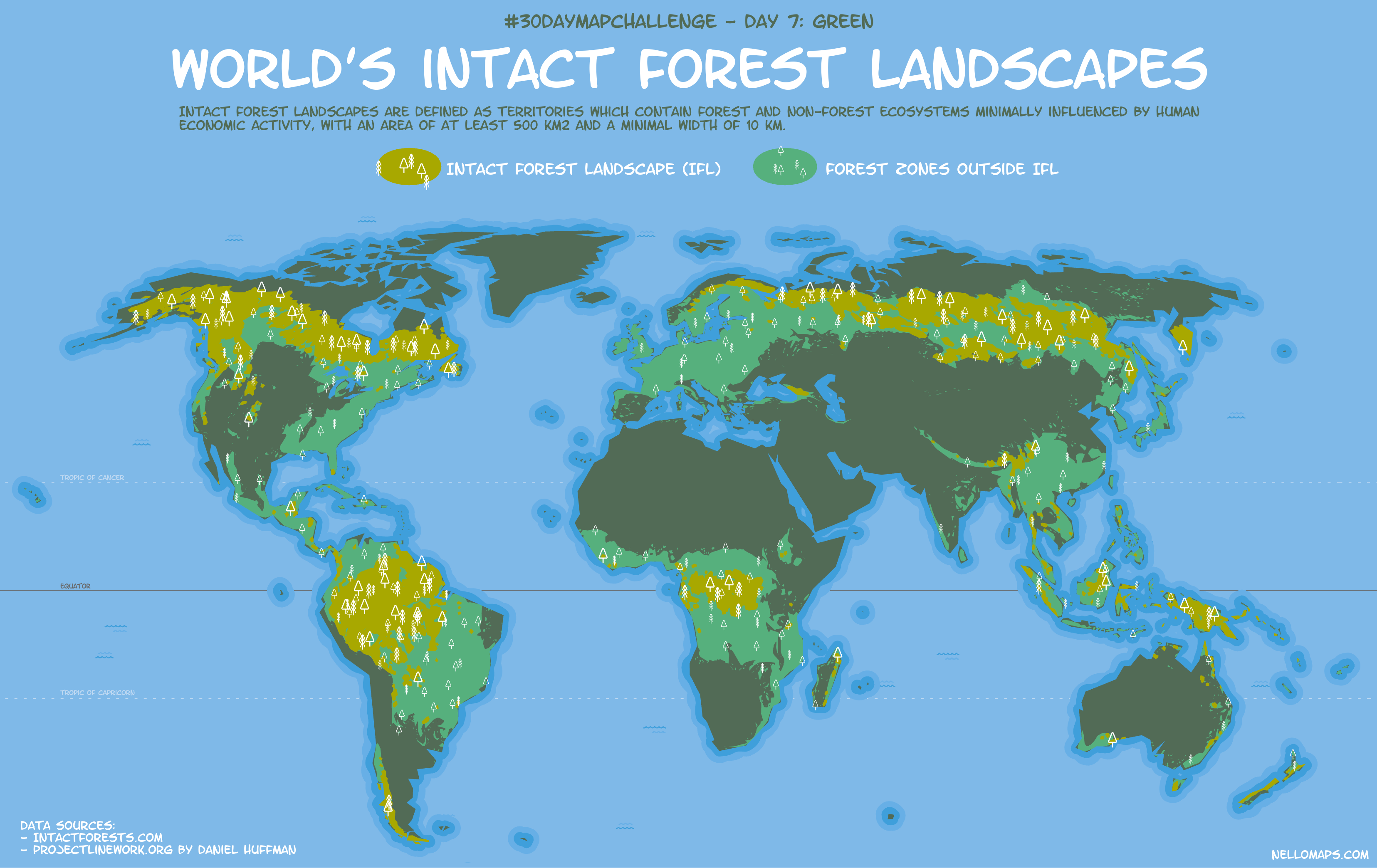
Day 7: Green
Today’s contribution is a map on so-called Intact Forest Landscapes and was fun to make as the creation included my favourite task: playing around with complex symbologies. Inspired by a tutorial on how to create an interesting forest symbology by my favourite cartographer John Nelson.
Tool: ArcGIS Pro
Data sources: intactforests.org, projectlinework.org
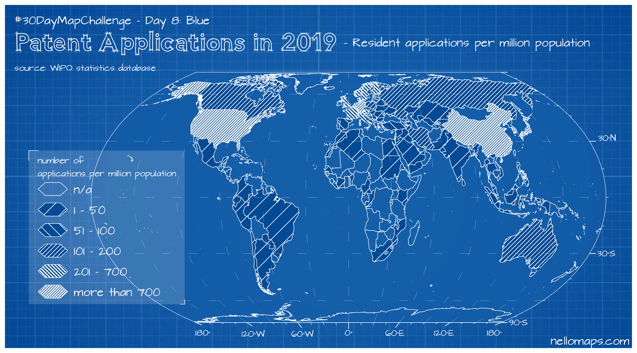
Day 8: Blue
Blue – Blueprint, that was the idea for this map design. Then I just went on a search for a dataset that fits the topic of blueprints, tinkering and constructing and I found a statistic about the number of applications for the grant of patents. Particularly challenging, but fun nevertheless, was the design of the hatched symbology that fits the chosen design.
Tools: ArcGIS Pro, Excel
Data sources: WIPO IP Statistics, Natural Earth
Day 9: Monochrome
While looking for topics to map in this challenge I found an amazing repository of data by the Norwegian Polar Institute on the Antarctic, already packed and visualized in QGIS. I spent some time browsing the available datasets and then decided to use this data to design a map with monochrome symbology. The map is packed with information that’s hard to distinguish, but the aesthetics are nice.
Tool: QGIS
Data source: Quantarctica

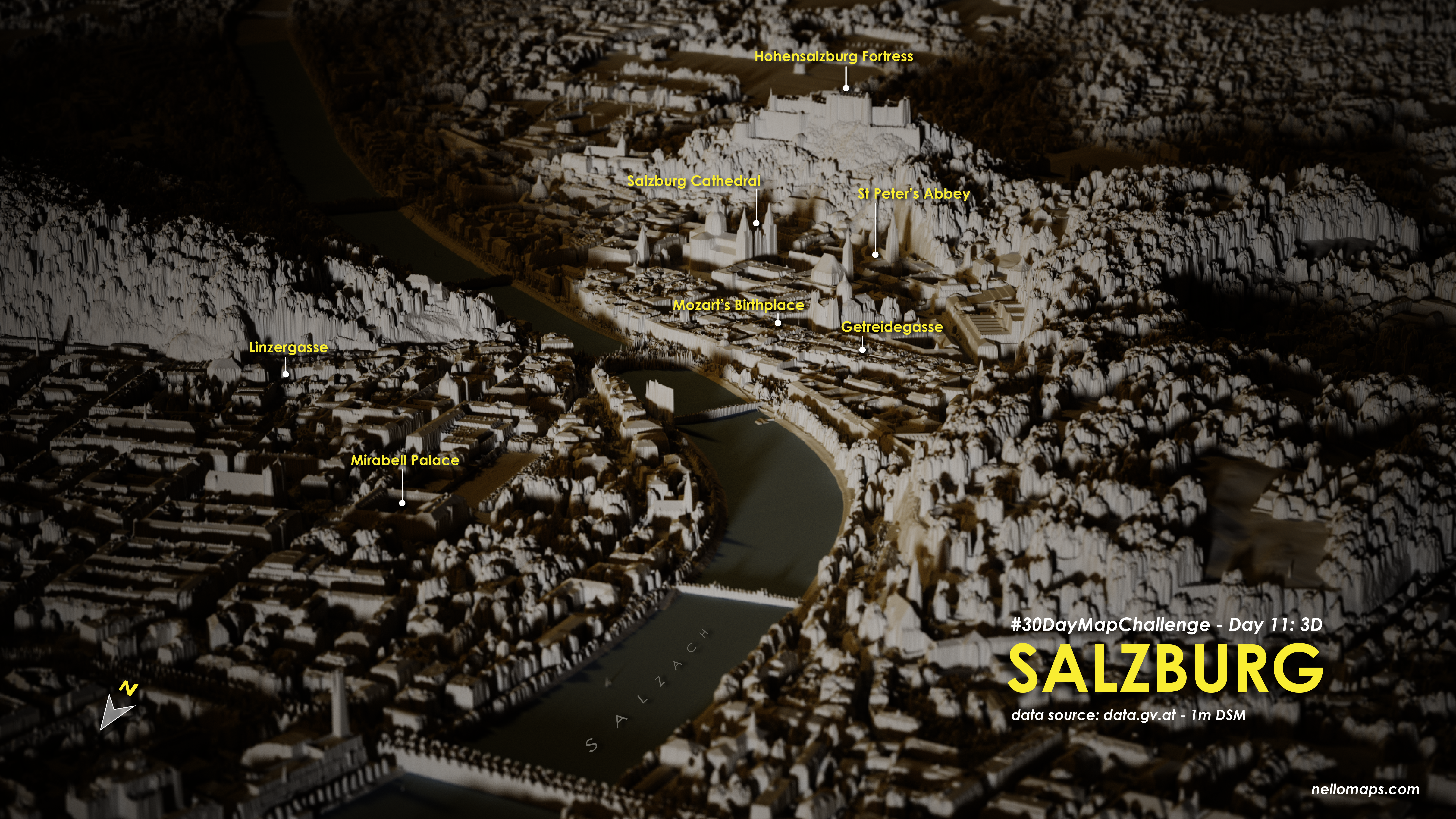
Day 11: 3D
I got to know Aerialod by following the 30DayMapChallenge in 2020. I admired the amazing results of other creators and decided to give it a try as well. I used a very high-resolution DSM of the city of Salzburg in Austria and just fiddled around until I got a nice looking, sort of atmospheric and miniature looking visualization of the city’s geography. The final touches of callout labels and a 3D label of the river Salzach were added in Adobe Illustrator.
Tools: Aerialod, Adobe Illustrator
Data source: data.gv.at – 1m DSM
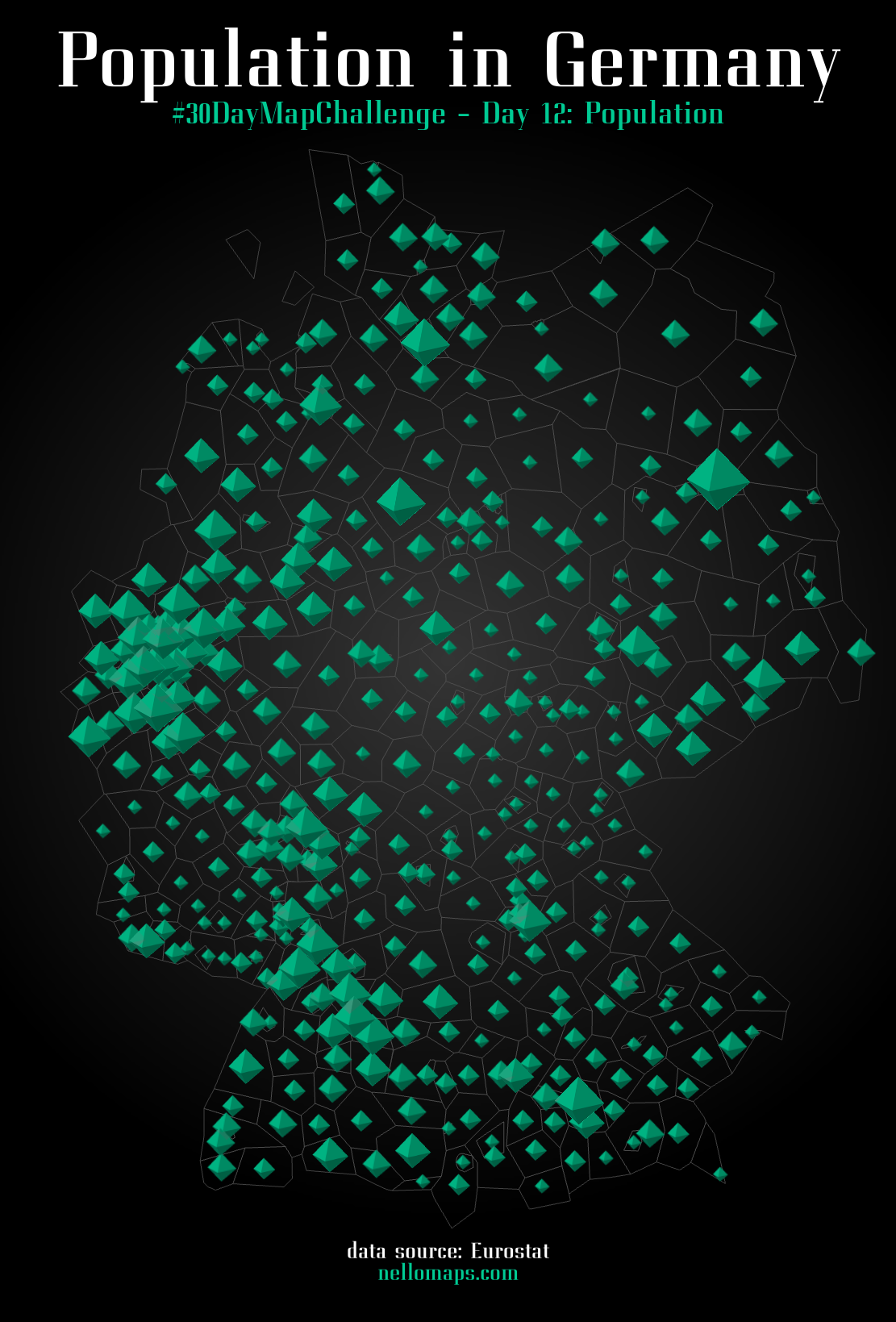
Day 12: Population
Quite a simple map showing the distribution of population in Germany. I like the look of the diamond shaped points (that I found while browsing the ArcGIS Pro symbologies) and the abstract polygons underneath.
Tools: ArcGIS Pro
Data source: Eurostat
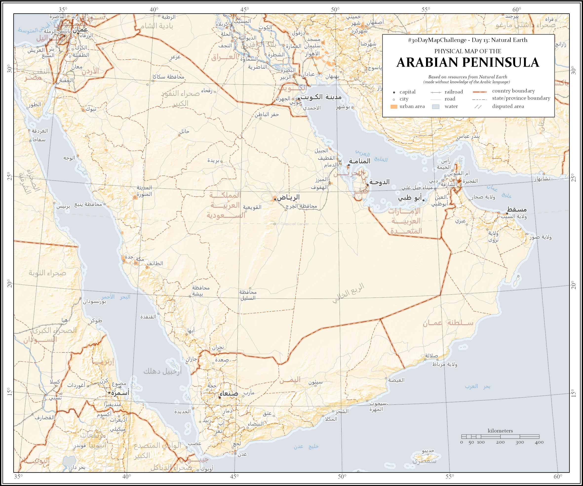
Day 13: Natural Earth
A topographic map of the Arabian Peninsula. I figured it would be interesting to use the Arabic Script that is included in the dataset. I love the #30DayMapChallenge for making me try new things like that just for fun. In hindsight, this was not a good map for the 30DayMapChallenge. There is just no way to make a complex map like this in such a short time. Things like accurately placing labels were not possible to achieve in a day of work. The map looks impressive at first sight, but once you look for the details a lot of improvements would be necessary that were not perfectly solved by the automatic labeling placement.
Tool: ArcGIS Pro
Data source: Natural Earth
Day 14: New Tool
Kepler.gl was one of the tools suggested to use in this challenge. I gave it a try and symbolized GPS points of hiking trails in the state of Bavaria, Germany. Based on the height information of the measuring points, you can see the underlying terrain.
Tools: Kepler.gl
Data source: LDBV

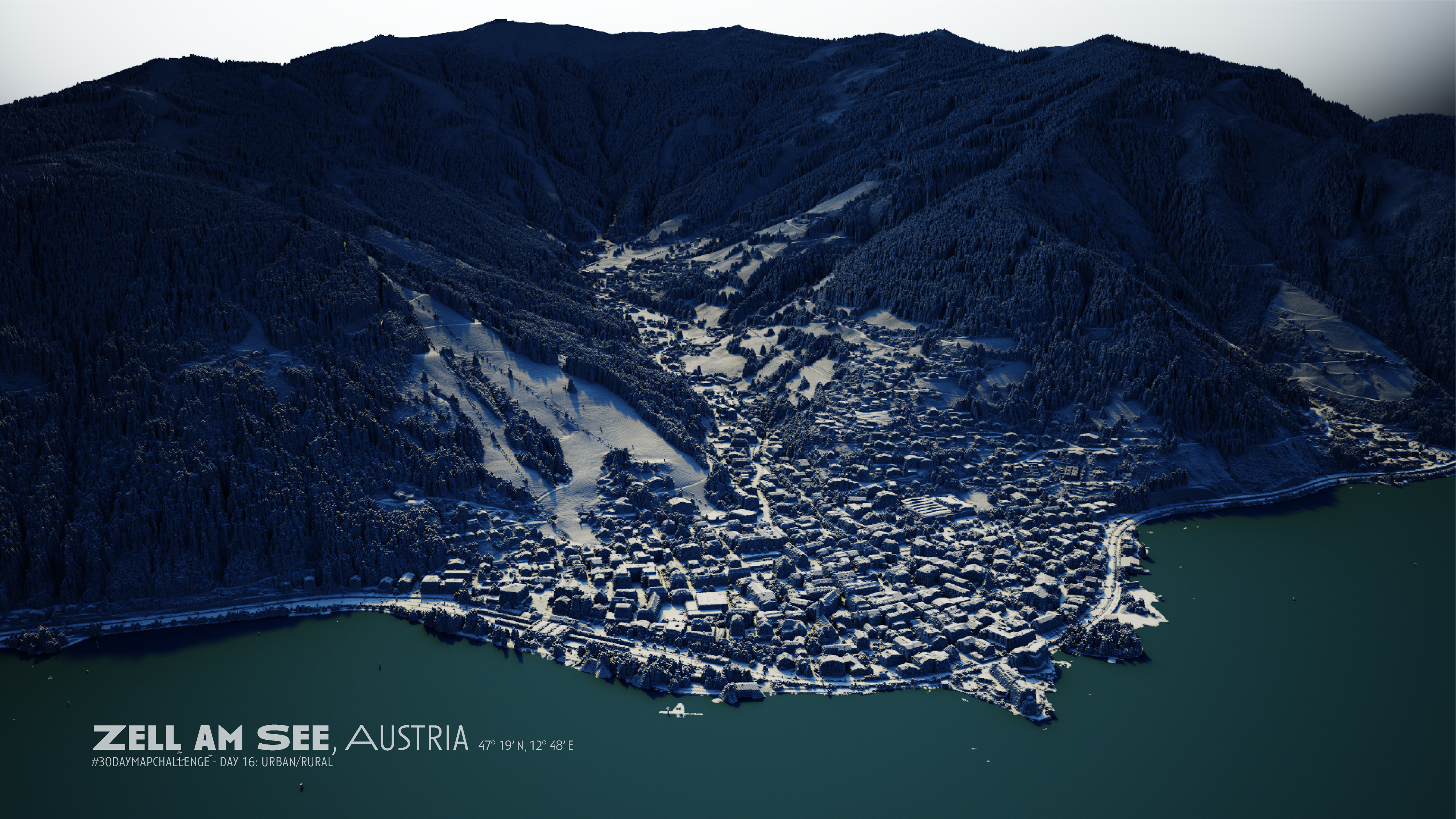
Day 16: Urban/Rural
I started to love to work with Aerialod. So I used it to visualize the urban area of a small town in Austria and the rural mountains in the background.
Tool: Aerialod
Data source: data.gv.at – 1m DSM
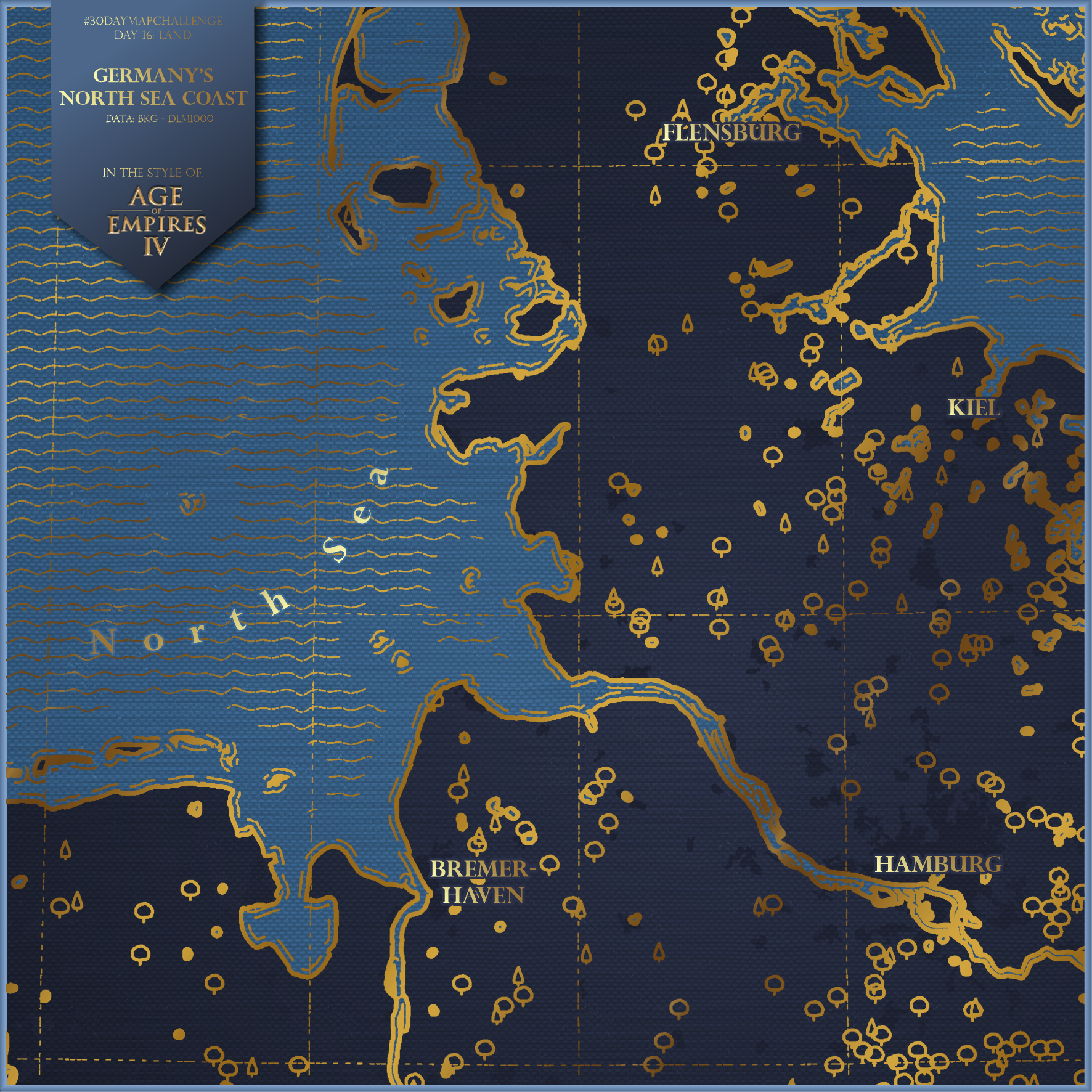
Day 17: Land
I am enjoying the recently released video game @AgeOfEmpires IV. I really like the maps that can be found in the game and decided to recreate this cartographic style for mapping a place in the real world.
Check out this tweet to see how the original maps look in the game.
Tools: ArcGIS Pro, ArcMap for Adobe Illustrator, Adobe Illustrator
Data source: DLM1000 – BKG

Day 18: Water
A river map made from text labels. I tried to create this map with the ArcGIS Pro labelling settings first but couldn’t achieve a satisfying result. That’s why I used ArcGIS Maps for Adobe Creative Cloud to import the geometries and added the text manually via the text on path tool.
Tools: ArcGIS, ArcMap for Adobe Illustrator, Adobe Illustrator
Data source: BKG – DLM250
Day 19: Island(s)
One impressive example to connect islands is the Eurotunnel, which allows to travel between France and the UK. But I never was able to imagine the size and impressiveness of this tunnel, so I visualized the connection in this simple map.
Tool: ArcGIS Pro
Data sources: Copernicus Sentinel-2, OpenStreetMap

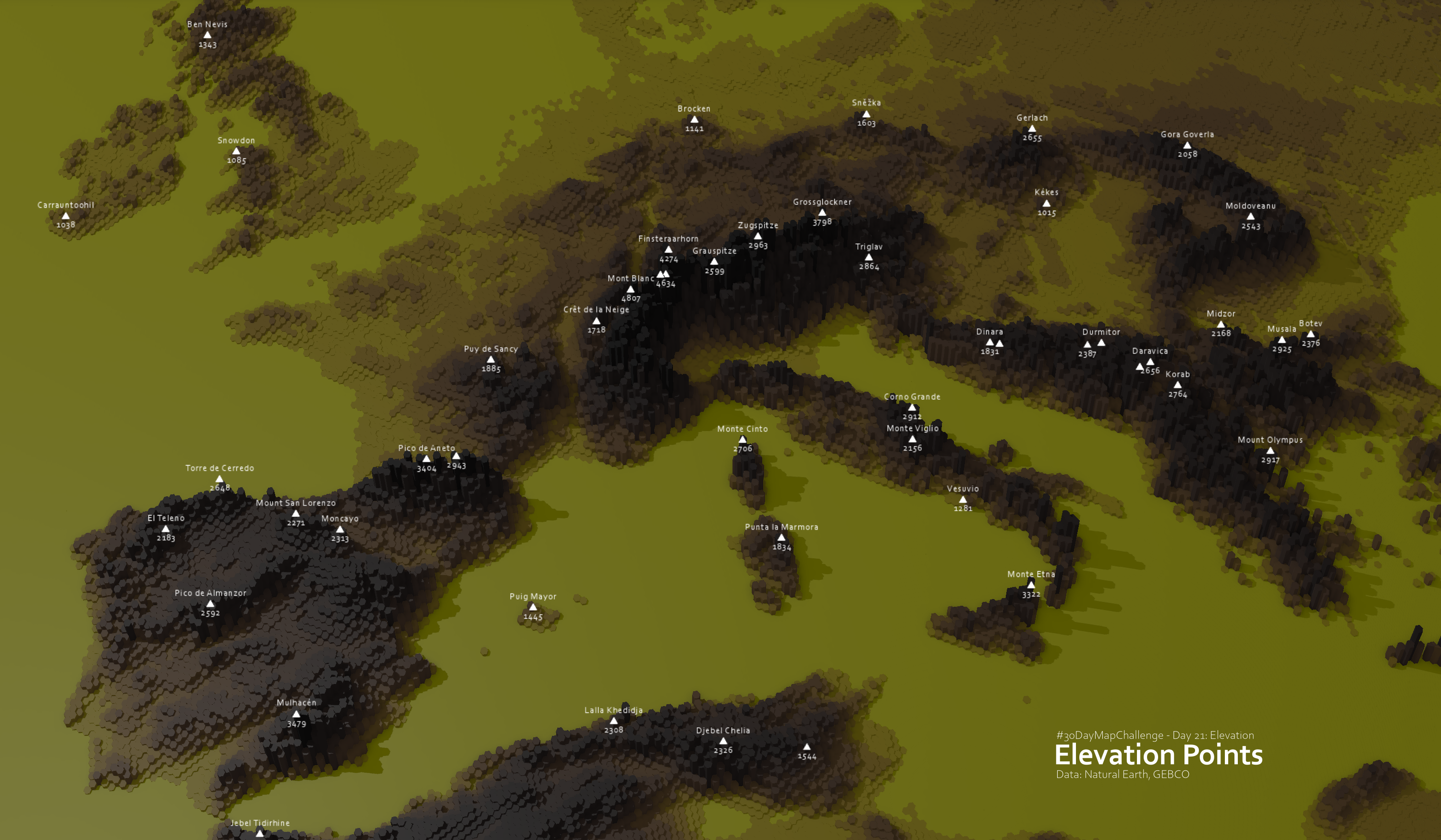
Day 21: Elevation
Stylized 3D terrain with some important elevation peaks of Europe. Made entirely with ArcGIS Pro. Unfortunately the labeling has some issues and is limited in 3D mode. Other than that, i am pretty happy about what I achieved.
Tool: ArcGIS Pro
Data source: GEBCO Grid
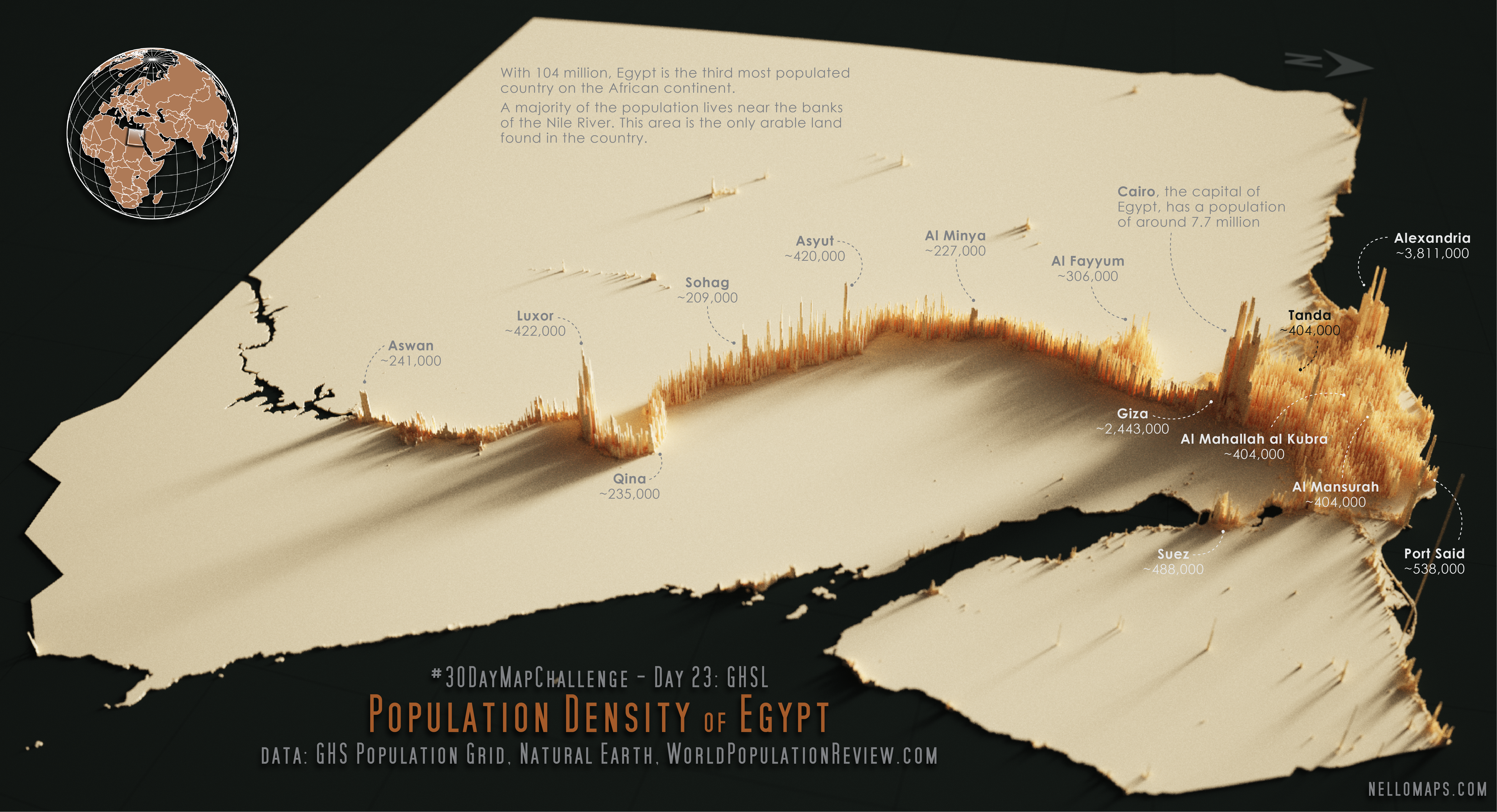
Day 23: GHSL
I found out about the existence of the GHSL database through this challenge, and I am very thankful for that. On the search for interesting aspects of population in different countries I learned about Egypt’s unique distribution of population along the Nile River and decided to make it the topic of my map. I took inspiration from Alasdair Rae’s workflow and a design by @KennthWong on population maps made with Aerialod.
Tool: Aerialod, Adobe Illustrator
Data sources: GHS Population Grid, Natural Earth, WorldPopulationReview.com
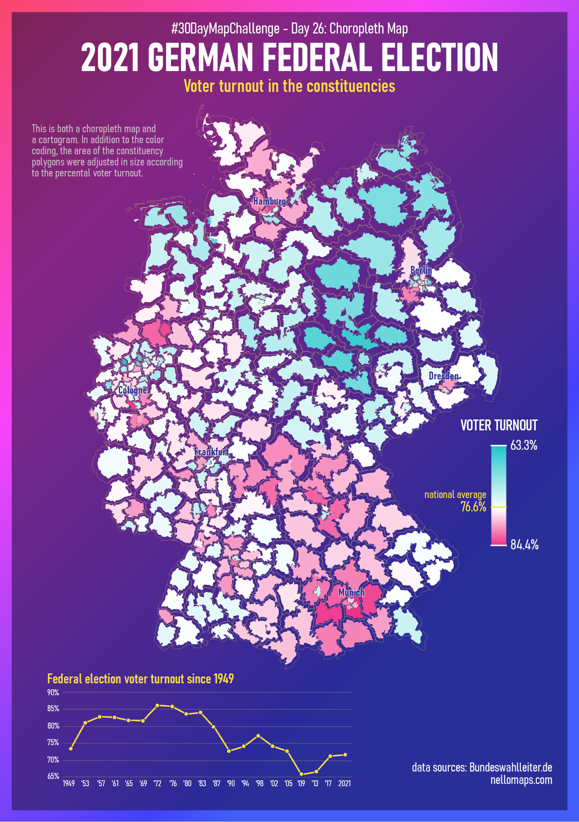
Day 26: Choropleth Map
This is one of the most time-consuming maps of this challenge as I used quite a few different tools and data sources. But I’m all the more proud of the result.
Data sources: Bundeswahlleiter.de, Natural Earth
Tools: QGIS, QGIS Shape Tools Plugin, ArcGIS Pro, Excel
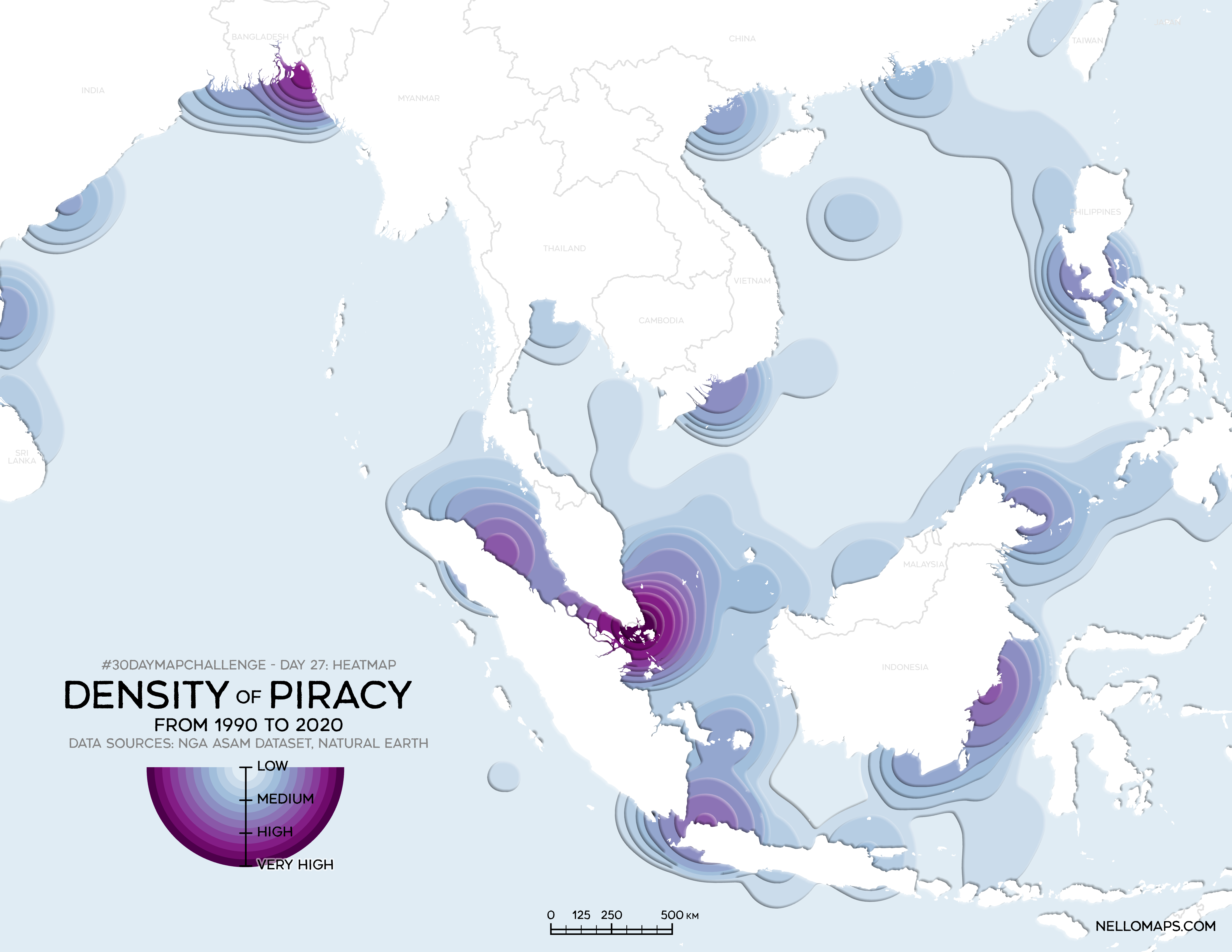
Day 27: Heatmap
A heatmap of piracy incidents over the past 30 years. I took inspiration of the symbology from a map by @neocartocnrs from last years 30DayMapChallenge and had fun trying to recreate the style with ArcGIS Pro. In addition, I was able to revise on how the Kernel Density method works.
Tools: ArcGIS Pro
Data source: NGA ASAM dataset, Natural Earth
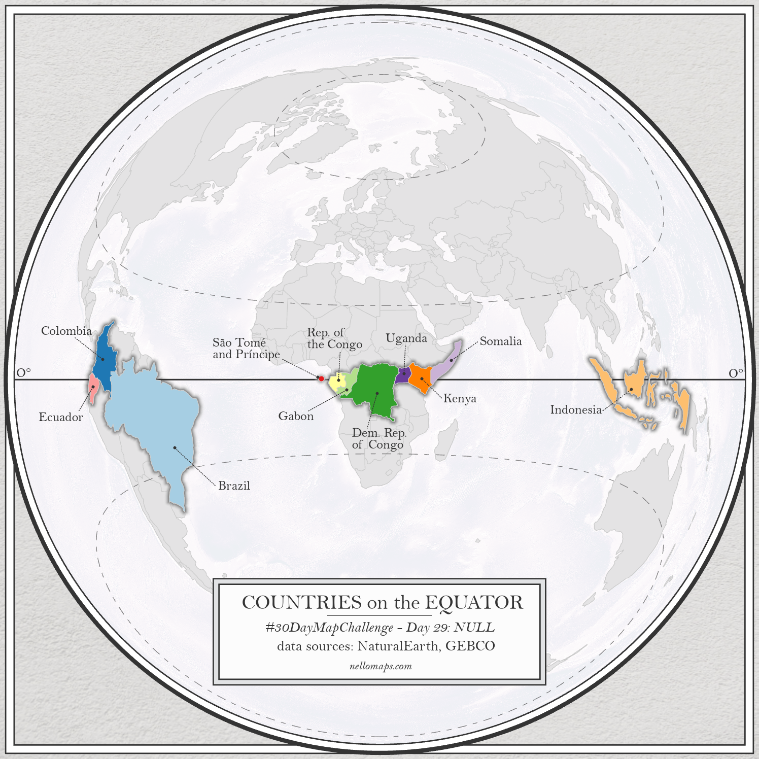
Day 29: NULL
Countries on the Earths 0° latitude – the Equator. The twitter community found 2 errors in this map: excluding Somaliland and the labeling of Gabon and the Republic of the Congo. Welp, its all about improving!
Tools: ArcGIS Pro
Data sources: Natural Earth, GEBCO Bathymetry GRID
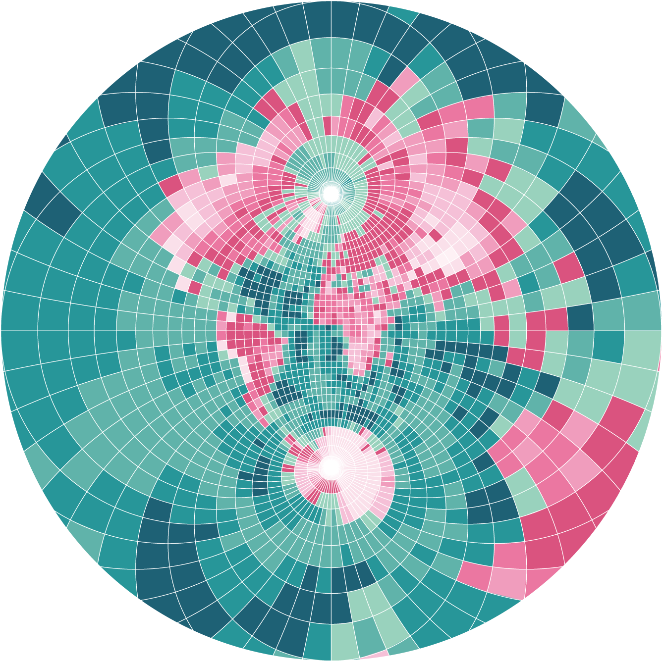
Day 30: Metamapping Day
The final day was dedicated to create some metadata about the created maps. I decided to collect all of them in this gallery and to add data sources, tools and background information.