
In the following, I will explain in detail how I created this small multiples map using mainly ArcGIS Pro and Adobe InDesign for the layout.
Small multiples depictions require repeating creating visualizations of a phenomenon many times. A programmatic approach seems natural to efficiently solve this task (for example in R). In my workflow, I am using a combination of batch processing, ModelBuilder, and Python scripts in ArcGIS Pro to automate processing steps for large numbers of identical tasks.
To follow along with my workflow you will need ArcGIS Pro with the Spatial Analyst or Image Analyst license.

Workflow:
I. MAP CONCEPT
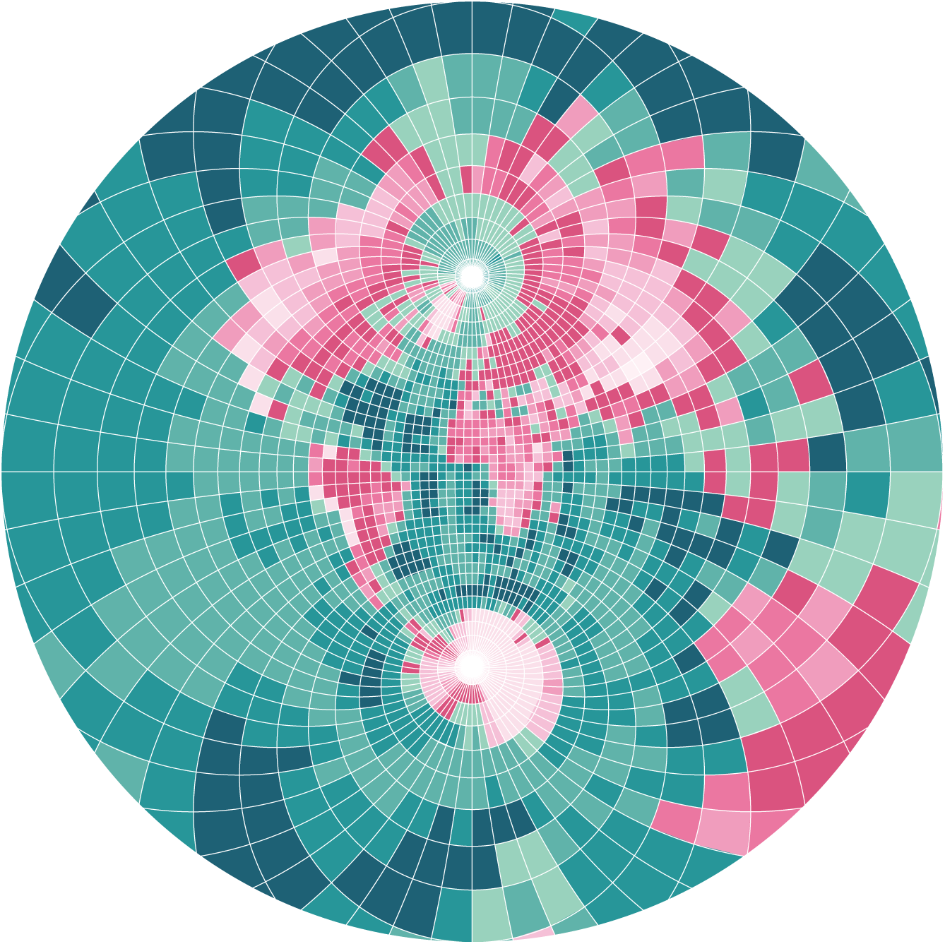
The concept of small multiples is to visualize a series of diagrams or maps presented side by side. Only one dimension (e.g. time) is altered between these otherwise identical representations. This allows to easily compare individual graphics and identify overall patterns and trends.
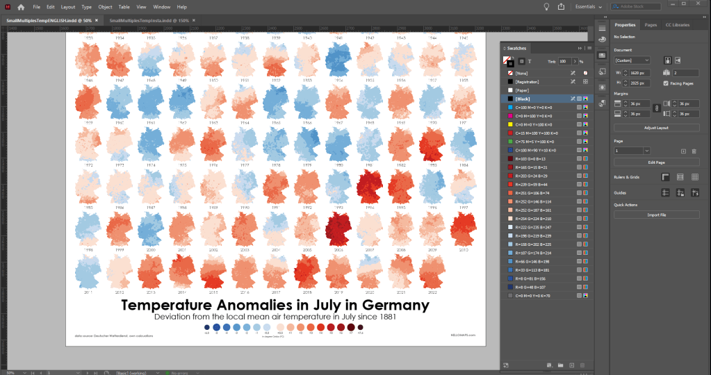
In my map, I am visualizing anomalies of the mean air temperature in Germany between 1881 and 2022 for the month of July. The fact that air temperatures have been rising in recent years is clearly visible in the resulting map. At the same time, the small multiples map also shows that the change in average temperature is not a simple linear increase, but rather a fluctuating change with occasional strong regional differences in some years. All in all, this map explains that the personal experience of temperature in July of a German inhabitant may vary. On the whole, however, the trend of rising temperature is clearly visible.
The idea of this kind of my map is no novelty. In my case, I was heavily inspired by the following map and tried to recreate their concept with my own data and workflows. Source: Zeit Online – Viel zu warm hier | 2019

II. DATA
For my map, I am using open data from the German Meteorological Service. Specifically, I am using a dataset of monthly mean air temperatures for July since 1881: Monthly Air Temperature July.
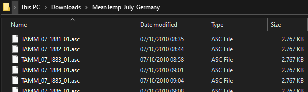
I am using FileZilla to connect to the FTP server of the data. This allows me to download the desired files in one batch. To extract the compressed files and to copy all the contents of the subfolders at once (flat view) I am using 7zip File Manager.
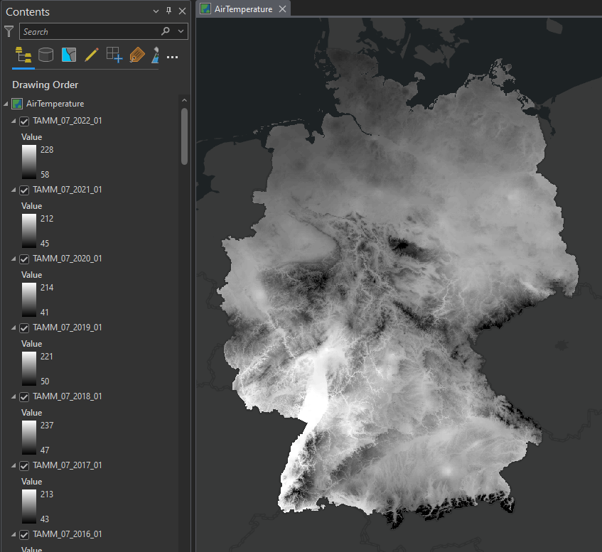
After downloading, extracting, and copying the data I have a folder with 141 files. Each file describes Germany’s mean air temperature in July in one year.
Ideas if you want to create your own small multiples map:
For a small multiples map many other datasets that are available in a regular interval over a moderately long time period are suitable. For example:
precipitation, landcover change, wealth indices, election results, member count, species occurrences
III. PRE-PROCESSING
In my case, the files come in ASCII (.asc) file format. This means that the data is stored in a human-readable raster of numbers representing the values (in my case temperatures in 1/10 °C).
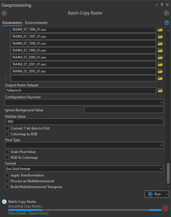
First, I am using the ArcGIS Pro geoprocessing tool Copy Raster to convert the ASCII files to raster files in a geodatabase for easier handling in the upcoming processing steps. I am using the tool in batch mode to convert all 141 files at once.
I am using the default settings. Noteworthy is the NoData Value of -999.
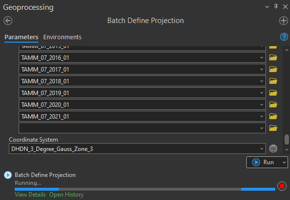
Next, as the rasters do have a unknown coordinate system information I am using the tool Define Projection to assign the correct projection to the rasters. The according information of the EPSG code (31467) can be found in the corresponding data set description.
Current progress:
141 Rasters with monthly mean temperature data for the years 1881 to 2022.
VI. SPATIAL STATISTICS
Now that I have all the data prepared in ArcGIS Pro I proceed to calculate the statistical values that are needed for my visualization.
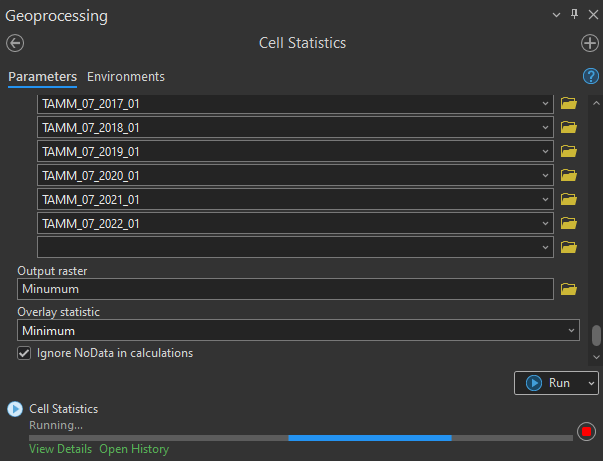
First, the geoprocessing tool Cell Statistics is used to calculate the overall mean temperature across all years for every individual pixel in the images. With this, each cell of the output raster stores its local mean temperature at the location of the pixel.
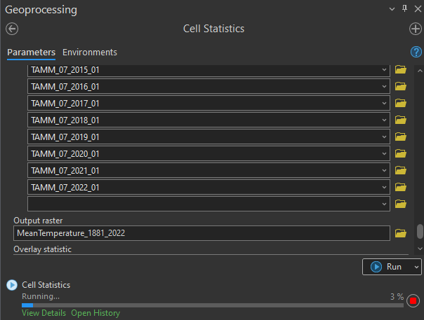
Next, I want to calculate the deviation from the total local average temperature value of each month. This output of anomaly values will be the raster data that I am visualizing on my final small multiples map.
The according formula is as simple as it gets:
Mean Monthly Temperature – Mean Temperature between 1881 and 2022 = Temperature Anomaly
For this calculation, the tool Raster Calculator can be used. Unfortunately, it is not possible to execute this tool in a simple batch mode. Therefore, I am using the ArcGIS Pro functionality of ModelBuilder to design a geoprocessing model in which the raster calculation of anomaly values is processed in a loop for all images.
The resulting geoprocessing model works like this: A Iterate Rasters loop is looping through the input rasters and from each, the total mean temperature raster is subtracted. The result is a raster for each month of local temperature anomaly values.

Current progress:
141 Rasters with monthly anomaly temperature data for the years 1881 to 2022
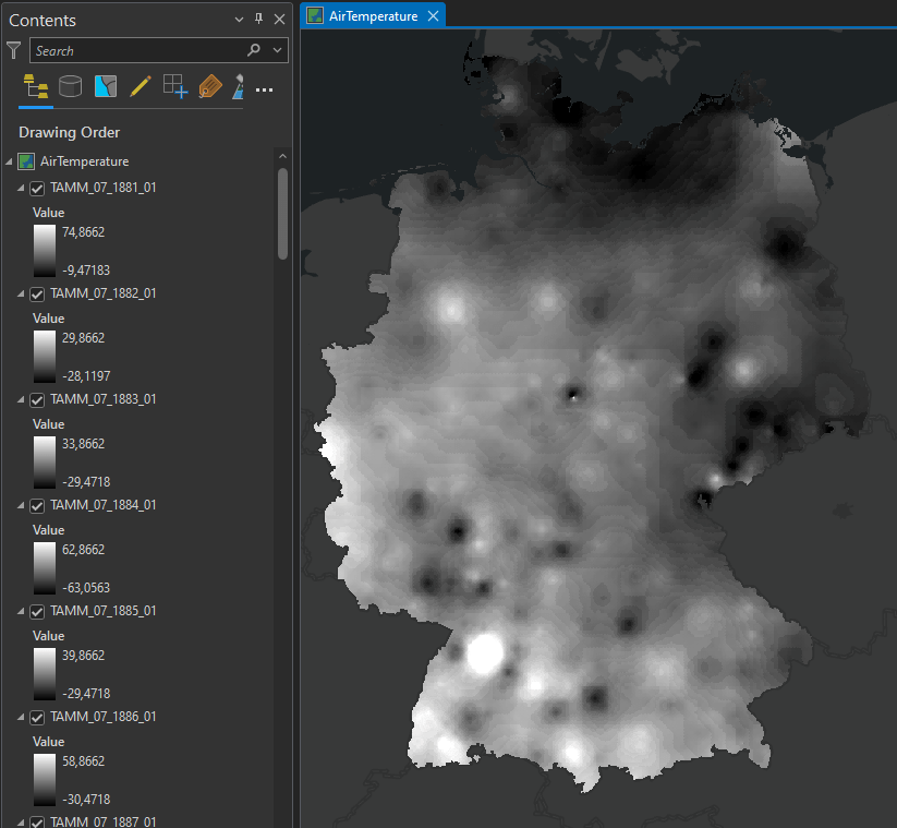
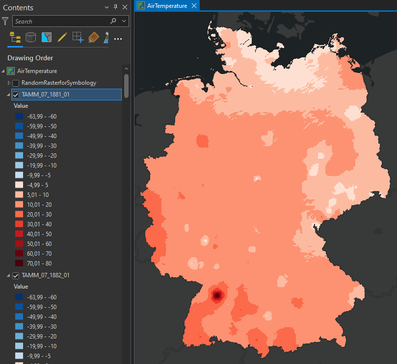
VI. SYMBOLOGY
By performing the spatial statistics calculations, I have produced 141 raster images, each showing the temperature anomaly of July for each year since 1881. At this point, ArcGIS Pro is displaying the rasters in the default grayscale gradient symbology. In order to effectively communicate the data, I am applying an intuitive and appealing symbology to visualize the temperature anomaly values.
To determine the value range of the symbology I am using the tool Cell Statistics again to determine the minimum and maximum values across all 141 rasters.
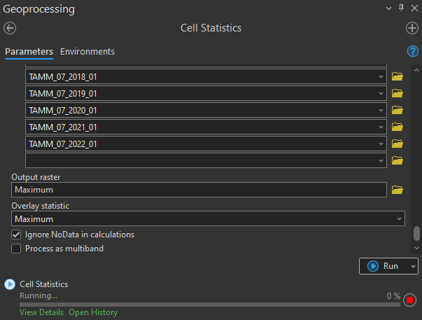
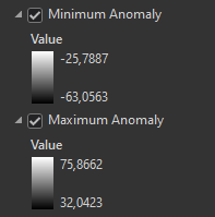
In my case, the maximum is 75.86 and the minimum is -63.05. Since the values were described as 1/10°C in the metadata document, this means that the highest positive anomaly is 7.5°C and the lowest negative anomaly is -6.3°C.

For the color scheme, I am using the world-famous climate stripes as it is a well-known palette associated with temperature differences. It makes the map intuitive to interpret without having to look at the legend or map description to understand what it is about.
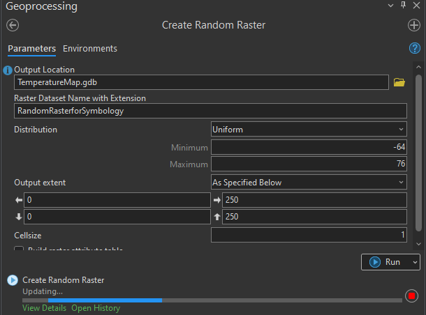
To create a symbology template that can be applied to all raster images I am using the geoprocessing tool Create Random Raster to generate a raster that covers the entire value range from -64 to 76.
Then, the classes for the anomaly values are defined in the symbology settings of the random raster layer.
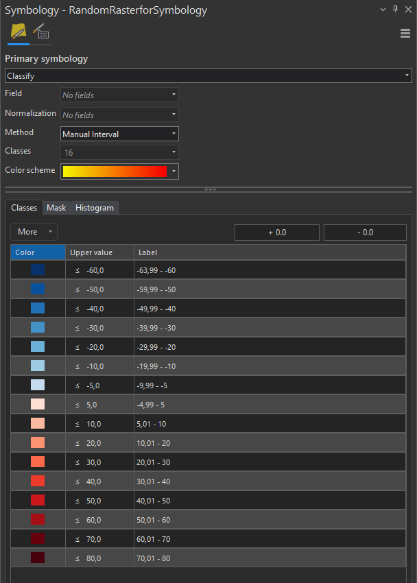
Finally, the tool Apply Symbology From Layer is executed in batch mode to transfer my symbology template to all raster images.

Current progress:
141 Rasters with monthly anomaly temperature values are symbolized with a color scheme.
VII. EXPORT
For the final step in ArcGIS Pro, I am exporting all 141 single rasters as PNG files to create a map layout in InDesign later. Unfortunately, I did not find a way to automatically place a large number of images in a regular grid in an ArcGIS Pro layout. Hence, I decided on the export as PNGs and a subsequent layout in Adobe InDesign.
To prepare the export, I am creating a small format layout page in ArcGIS Pro and placing a map frame on it. In addition, I am adding a text element of the raster’s year. I will be using this text element in the final map layout and already need to set the size, font, and color how I want it in the final small multiples map layout.
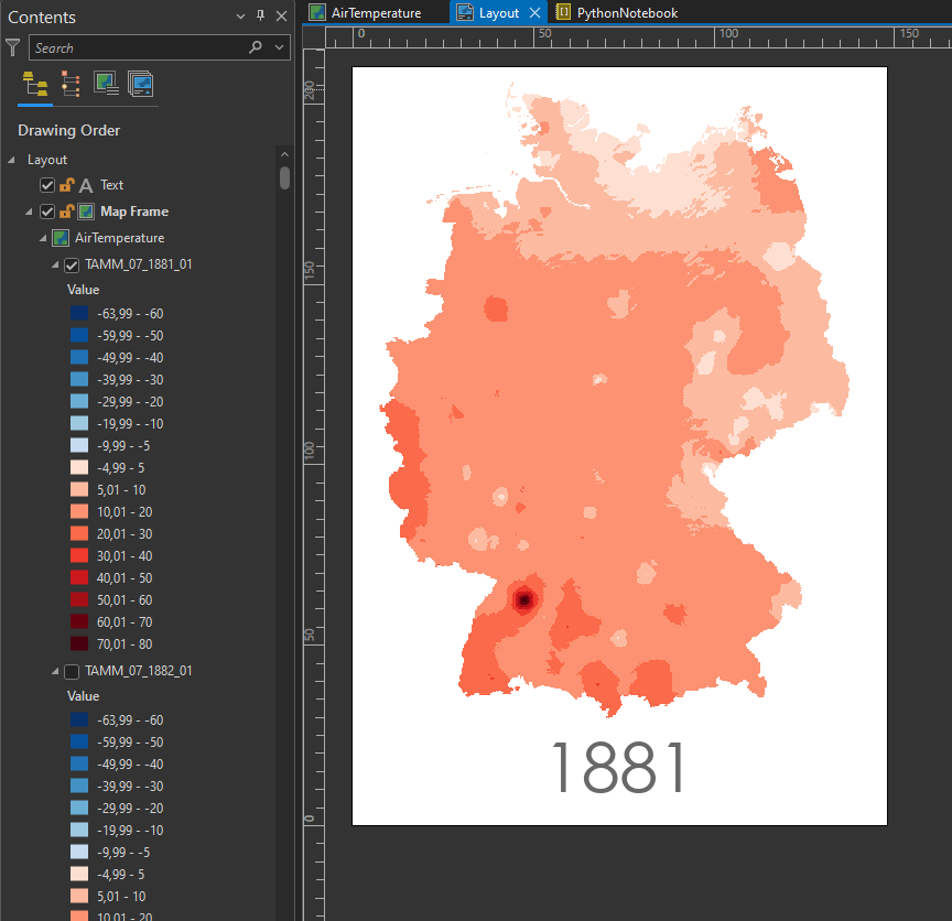
Next, I am using a Python script to automate the export of this layout to a PNG file. After doing so the script sets the next year’s raster visible, changes the text of the year, and exports the layout as a PNG image automatically.

#current ArcGIS Project
p = arcpy.mp.ArcGISProject("Current")
#Layout named 'Layout'
Layout = p.listLayouts("Layout")[0]
#The year text Element
yearText = Layout.listElements("TEXT_ELEMENT", "Text")[0]
# Define map to work in
m = p.listMaps("AirTemperature")[0]
#make list of all layers in map m
lyrList = m.listLayers()
#count the layers
numberoflayers = len(lyrList)

#Loop through the layers
i = 0
while i < numberoflayers:
  #turn off the visibility of all layers
  for lyr in lyrList:
   lyr.visible = False
  #turn on the visibility of a specific layer
  lyrList[i].visible = True
  #increase the year value
  year = 1881 + i
  #change the text to the year
  yearText.text = year
  #set the output path and file name
  path = "C:\\data\\" + str(year) + ".png"
  #Export as PNG with transparent background
  Layout.exportToPNG(path,transparent_background=True)
  i += 1
VII. LAYOUT
I am composing the final layout in Adobe InDesign as this software allows me to place all my images in a regular grid in an easy manner.
In InDesign, I can go to File -> Place and select all my images. Then, by dragging a frame and using the arrow keys I can create a grid of regularly placed images. For fine-tuning I am using the scale tool and to change the spacing of the grid I am selecting all images in the layout, clicking on the border and holding the spacebar to move the spacing between the images.
To finalize the map I am adding elements like title, subtitle, legend, and sources.
Thank you for reading!
