This set of maps was created in the course Thematic Cartography in my third semester of CDE.
For this assignment, a number of thematic choropleth maps were created that show key figures of the population in the Czech Republic. The four maps show different methods how statistical data can be visualized and presented.


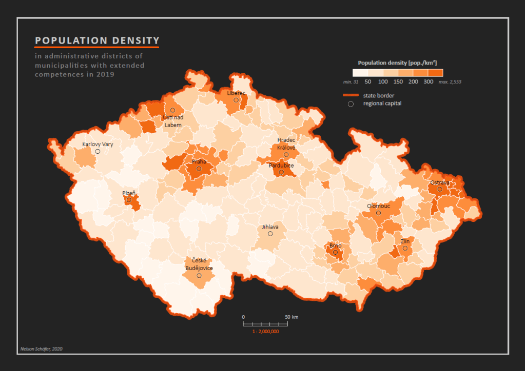
Map 1: Population Density
In this map the population density in the municipalities is shown. The population density values are divided into classes with a graduating orange hue from low to high. This way of visualization makes it easy for the reader to identify high and low hotspots in the map and to get an overview of spatial clusters of the depicted phenomena. The added locations of regional capitals give more context and spatial relation to the information.
All in all, this map is suitable for a rough and quick overview of the phenomena, is easy to read, but lacks depth and detail to serve as a basis for important decisions or findings.
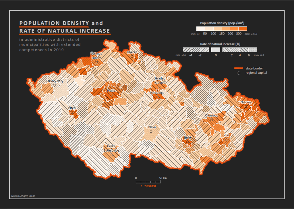
Map 2: Population Density and Rate of Natural Increase
In addition to the content of map 1, the phenomena of the rate of natural increase is added to the map. With this, the amount of information is not just doubled but additionally a comparison and relation between the two phenomena is possible.
As an example, it can be determined which municipalities have a high population density but might not grow further in the future or which sparsely populated municipalities can be expected to grow in number over the next few years because of their high rate of natural increase.
More content in a map offers more information but also decreases the readability of a map. Therefore, this map is more aimed to be used by experienced map readers and to provide insightful information about a complex topic.
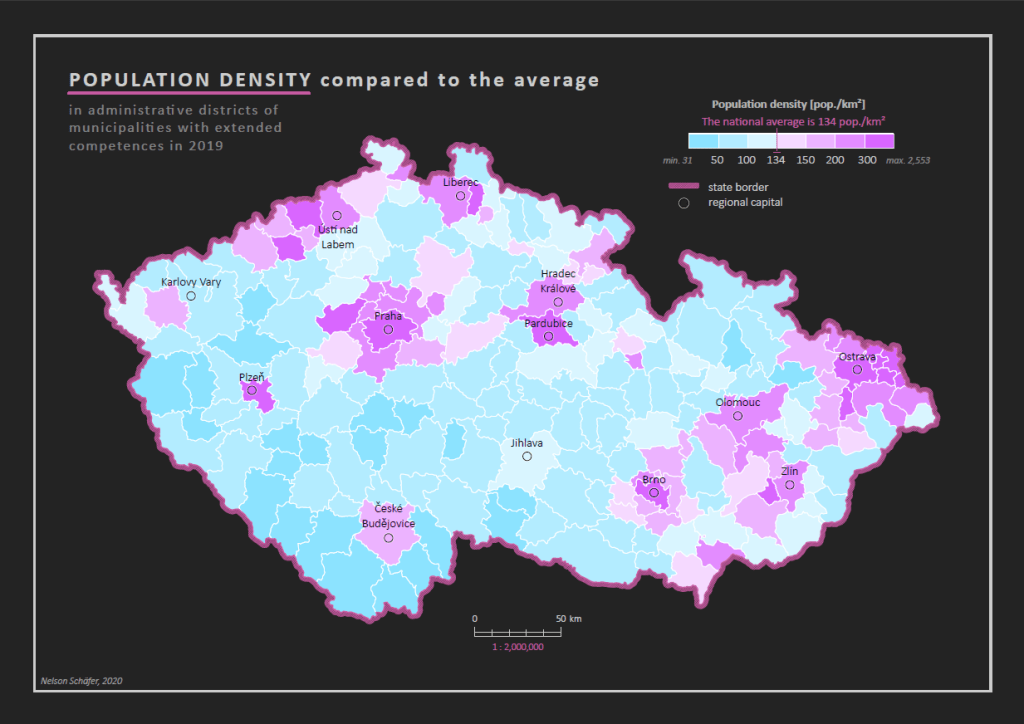
Map 3: Population Density compared to the average
This map shows the same values as map 1, but uses a different colour palette and adds a class at the national average of 134. Because two different colours are used for the classes higher and lower of the average, it is easily discoverable where in the Czech Republic the values are above or below the average.
Compared to the single graduated orange colour in map 1, this offers additional information to the reader. However, whether to choose this two-colour gradient or not depends if the average value is useful for the intended use of the map.
Map 4: Vital Index
The values of the vital index are visualized with unclassified colours in this map. This continuous colour gradient leads to an unlimited number of possible colour hues for the municipality areas, showing more accurate numbers and making small differences between the areas visible.
On the other hand, because of the limitations of the human eye to distinguish between hues, an exact reading of the hues in the legend is impossible.
This very detailed visualization method makes it more difficult to quickly grasp an overview of hotspots and clusters in the whole area but provides more information when comparing small differences between neighbouring areas. Therefore, this map is suited to be used by experienced users who wish to analyse this phenomenon in detail.

