
Objectives
Despite continuous improvements, the possibilities for creating cartographic animations in GIS software are limited compared to dedicated animation tools. The software Adobe After Effects is considered an industry leader when it comes to motion graphics, visual effects and the creation of professional animations. This thesis aimed to combine the value and power of spatial data with the sophisticated visualization capabilities of Adobe After Effects.
A set of five map animations was created on the common theme of shipping traffic, but each visualization constitutes of a unique dataset and animation style. Workflows to animate GIS data in Adobe After Effects were explored and documented. The quality of the animation output was assessed on the basis of user testing. Lastly, Adobe After Effects was evaluated as a tool to visualize spatial data.
Methodology
Among many others, the main type of input datasets for the animations were AIS ship positions, which were pre-processed in ArcGIS Pro. GIS software was used to prepare the input data to meet requirements that allow the creation of animations in the later steps. Since Adobe After Effects does not natively support the import of any spatial data, a workflow was developed to resolve this limitation.
To transfer the spatial data to Adobe After Effect the data was split up into a JSON file for the attribute values and Adobe Illustrator files to transfer the geometries to Adobe After Effects. By using the capabilities of scripting tools, the geometry objects of were animated through utilization of their decoupled data attributes in the JSON file.
Lastly, the advanced animation abilities of Adobe After Effects were employed to add effects and to add auxiliary elements. Titles, legends, charts, time indicators, lights, shadows, camera movements and more are included in the animations. The output of this work are five map animation videos on different phenomena of ship traffic with durations between 30 and 140 seconds.

Traffic Density of Pleasure Vessels on Lake Superior
The first created animation deals with Lake Superior and the activity of vessels of the category pleasure vessels in a period from March 2017 to December 2019. In the 35 seconds duration of the animation video, the heights of 1,371 hexagons are shifted at monthly intervals based on the recorded activity in the respective areas of the lake. From this animation, phases and areas can be recognized in which there is a particularly high level of activity and how this activity changes during the months.
Incidents of Piracy in the Indian Ocean
This animated map is visualizing piracy incidents and similarly classified events between 1990 and 2020. On a slightly rotating globe, the incidents in the Indian Ocean and the adjacent seas are shown over time by using flashing illuminated points. During its runtime, the animation video additionally shows the development of worldwide piracy events using an animated graph.
3 Days of Shipping Traffic in the Port of Piraeus
The third map animation shows the Port of Piraeus in Athens and the shipping traffic for three consecutive days in July 2015. Individually moving ships, which are colored differently according to their vessel categories, move in a three-dimensional scene. In addition, a number of auxiliary elements improve the information content. Among other things, a dynamic change of light shows the currently displayed time of day, and an included overview map clarifies the location of the depicted area. Furthermore, the different port regions of Piraeus are shown and allow of a better interpretation of the observed ship movements.
Transits on Artctic Shipping routes in 2019
In the animation about the arctic ship routes in 2019, many different components were combined. The animation explains the relationship between the change in the expansion of the Arctic sea ice and complete traverses of the Arctic ship routes. The animation contains the changing extend of the sea ice as well as statistics on transits between the oceans on the various Arctic ship routes. The visualized content of this animation is supported by, among other things, a rich basemap and a chart of statistics from the last few years.
1 Week of Shipping Traffic in the Hawaiian Islands
For the last map animation the shipping traffic on the Hawaiian Islands was visualized. In the 90 seconds of the animation, ships are moving individually over a period of one week. In addition, this animation is characterized by the realistic landscape with three-dimensional terrain and textures from satellite images. The categories of different ship types are reflected by differently colored vessels, and the most important ports of the regions are shown give more context about the ship routes.
User Testing
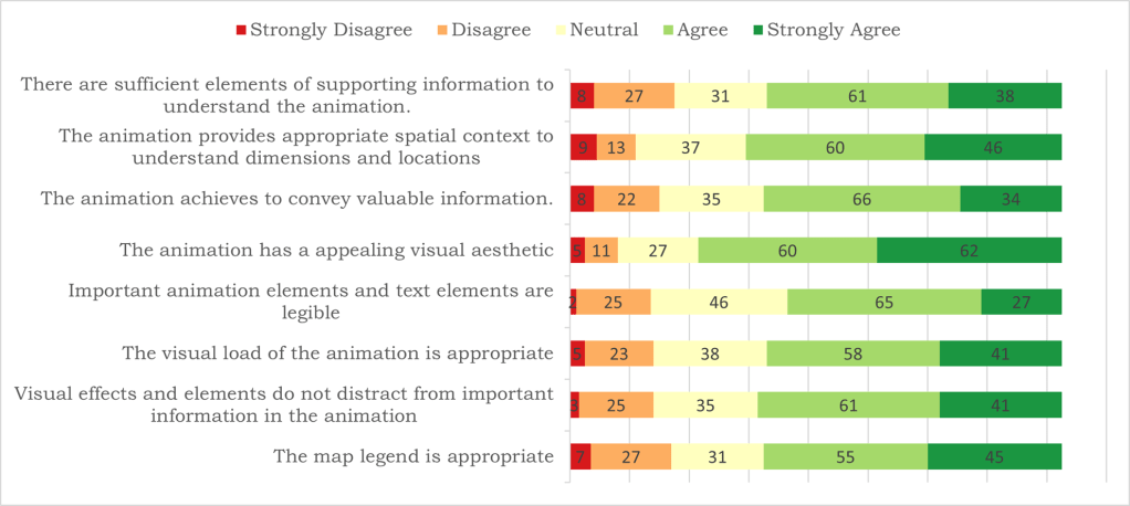
To evaluate the quality and effectiveness of the created map animations an online survey was conducted. The evaluation results showed that the animations made a largely positive impression on the survey participants. However, the most frequent point of criticism was overwhelming or confusing information load due to too many elements, too small elements, or too quickly moving elements in the animations.
Conclusion
Compared to animation tools in GIS software, the advantages of working with spatial and temporal attributes that are tightly integrated in the program logic is missing in Adobe After Effects and requires custom solutions. Additionally, the development of scripts and extensive manual labor is time consuming, and the number of animated objects is limited due to heavy processing loads.
However, with the knowledge of the strengths and weaknesses of the software, unique animations can be created, which clearly stand out from the standard solutions from other animation tools. The amount of effort required to create an animation is well worth it if the purpose of the animation is to create visually impactful animations that attract attention, are visually enjoyable and that possibly introduce uninterested people to explore the visualized topic.

One response to “Master’s Thesis: Map Animation Videos”
[…] Schäfer wrote a wonderful thesis on using scripting for mapping in After Effects in 2021. I referenced this resource in my talk, and […]