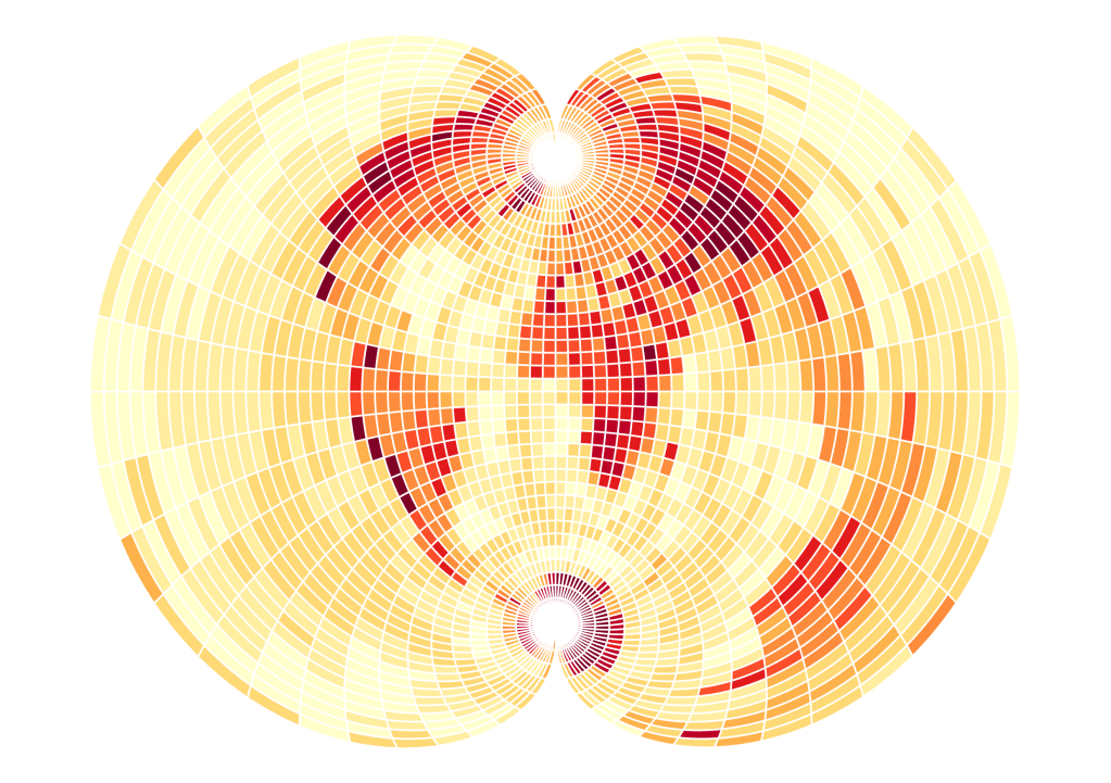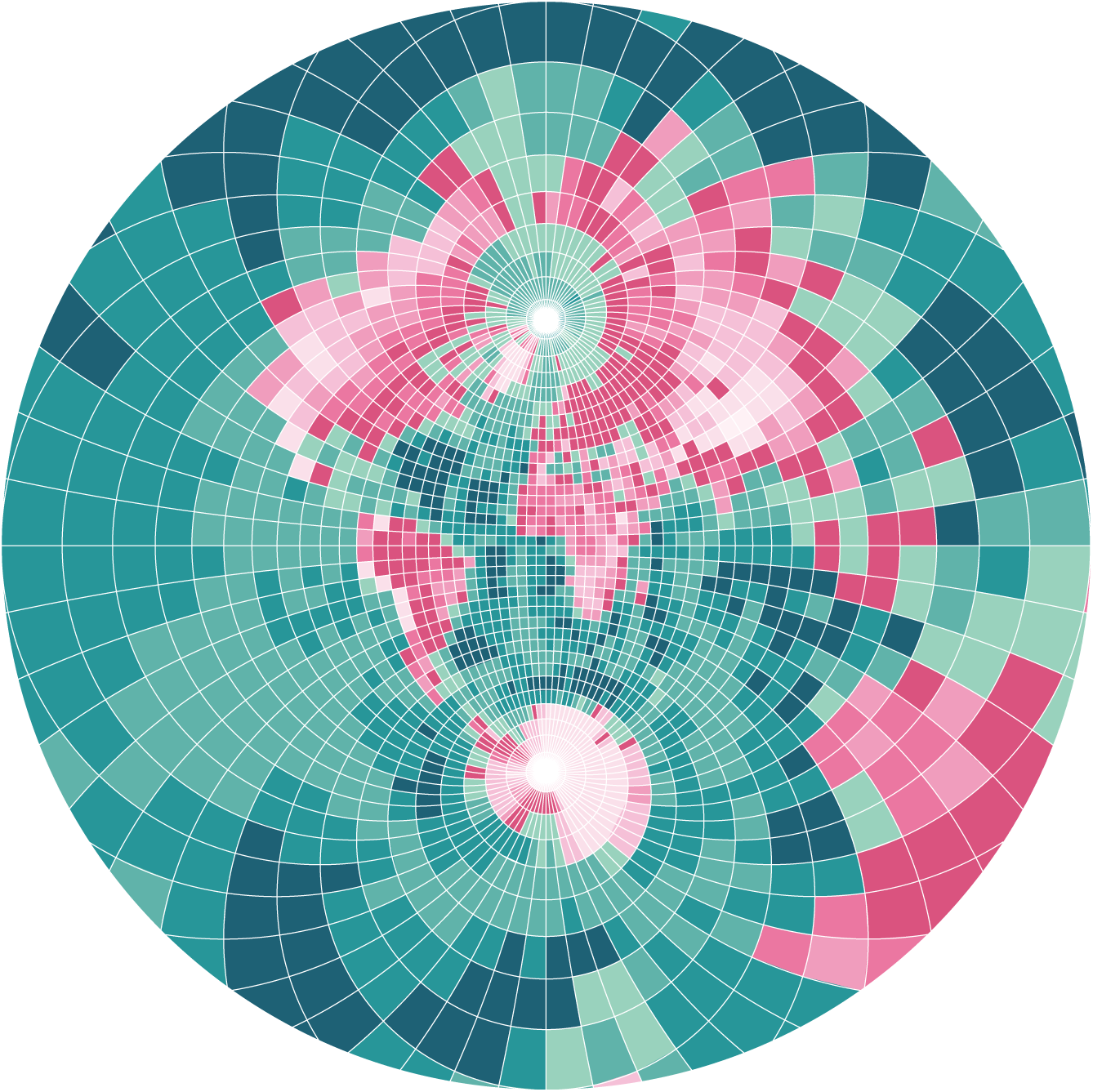

In this tutorial I will explain how to create pixel maps. Besides their aesthetics, they are a great way to visualize distortions in map projections. Similar to Tissot’s Indicatrix, the variance in the pixel’s geometry show what would be same size on the Earth’s surface.
My method to create these maps is based on raster data. I am using a global DEM as a basis to classify the colors of the map pixels. But any other raster dataset works just as well, depending on what data you want to visualize.
My tool of choice is ArcGIS Pro, but you can find the same functionalities in software like QGIS as well.

I. DATA
Let’s start by acquiring the data and adding it into a new GIS project:
- Graticule : can be downloaded from Natural Earth. For this tutorial I am using the WGS84 bounding box and the grid with 5 degree increments. For the scale of the map in this tutorial, I found 5 degrees to be the best compromise between map detail and visibility of pixels distortions.
- Raster data: For small scale maps Tom Patterson’s Blue Earth is a good source for global elevation data.
II. Reclassify Raster
The Blue Earth raster data contains values ranging from -10.528 to 6.655 that describe the global elevation in meters. I will reclassify these values into 10 classes that will be used to visualize the elevation in the final map.
In ArcGIS Pro the geoprocessing tool Reclassify can be used for just that. As input parameters I choose 4 value ranges for elevation below sea level and 6 classes for values above sea level. The value break at 0 is important if you want to apply different symbology for ocean and land in the final map.
The result is a raster with just 10 different values, where each class represents a range of elevation values.
III. Resample Raster
In this step I will resample the resolution of the raster to achieve the pixel look. I am using the ArcGIS Pro tool Resample with the following input parameters:
X and Y define the desired pixel size in the input data units, in my case degrees. Also, it is important to choose Nearest as Resampling Technique to maintain the 10 defined classes.
(Make sure that your raster’s spatial reference system is a geographic coordinate system as we need the unit degrees to calculate pixel sizes with 5 degree increments. The Blue Earth elevation dataset’s unit is degrees, so no reprojection is required in my case.)
The resulting raster:
V. Symbology
This reclassified and resampled image already comes quite close to what we want to achieve. Next, we will adjust the symbology for aesthetic looks and improved legibility.
First, let’s add the 5 degree graticule. As the graticule’s increment matches our pixel size, the grid creates an effect of slightly spaced pixels. Additionally, I add the downloaded bounding box shapefile to create a frame around the map.
Next, let’s define the colors for the raster symbology. I frequently use coolors.co to find inspiration for color palettes. In this example I decide to go for blue hues for elevation classes below sea level and pink hues for elevation classes above sea level.
After specifying these colors in the symbology pane of my layer, the result looks like this:
VI. Define Projection
All that’s left to do is to define the projection that you would like to use for your map. For my map I choose Stereographic in the ArcGIS Pro coordinate system settings.
And just like that you have a neat pixel map.
Here is a handy list of supported map projections in ArcGIS Pro that you can use for inspiration. Here are a few ideas: