During my time at the Department for Geoinformatics at UPOL, a large number of maps were created from small projects or tasks. This post is a collection of simple maps that I consider worth sharing for a variety of reasons.
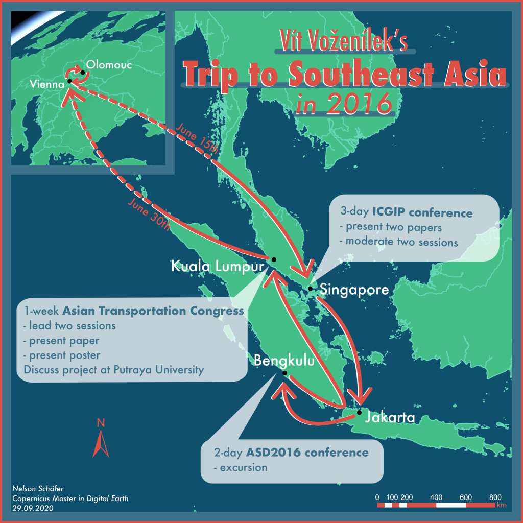
I. Travel Map from text description
This map was the first map that I created in the Geovisualization track. At the beginning of this task there was only a text which described a business trip to Asia with several stops. The task of the students was to translate this descriptive text into a map – without further instructions or limitations.
The challenge turned out to be to answer the questions which information in the text seemed to be worthy of including in his map. Is it important to include the airline with which the flights were made? Are exact dates for all stops necessary? How do you represent a travel route that stretches halfway across the globe but still has many closely spaced stops in Asia?
The individual answers of each students to these questions result in completely different results as a map.
For my own map I decided on a non-serious and playful design by using bright colours and by avoiding straight lines and corners. The basemaps and the geolocation of the travel stops was created in ArcGIS Pro. The arrows of the route and the text elements were added in Vectornator (a graphic design software for iOS) on an iPad.
II. Generalised map of the Czech Republic
As a part of a lecture on the topic of map generalisation this map was created. The objective of the task was to generalise data to a much smaller scale using a variety of tools in ArcGIS Pro. Using definition queries, classifications, smoothing-tools and generalisation algorithms the readability of the data in this scale was maintained.
One possibility to assess if a map was generalised well is to compare the map load of the map before and after generalisation. The map load is a measurement or evaluation of a map regarding the amount of information and density of the content. Here a edge detection and contrast algorithm was used to compare the map load values.
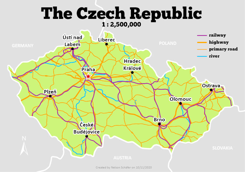
A quantization of the map load can be useful in order to quickly assess the complexity and information density of maps and to create comparable values. Both, high and low map loads can be appropriate, depending on the intended use of the map.
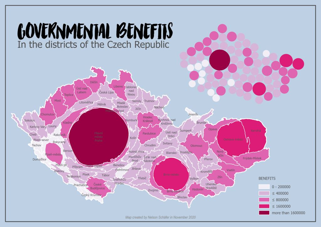
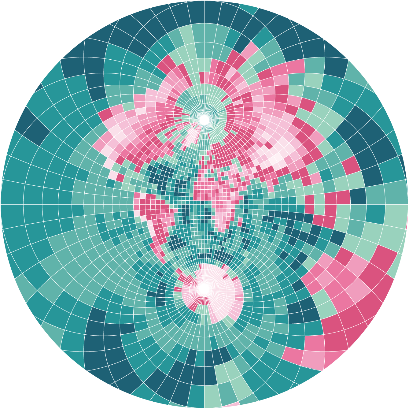
III. Cartograms
Cartograms are thematic maps in which the area of polygons gets altered according to a selected variable of each polygon. In the case of my map the amount of social benefits was used to directly proportional change the size of the municipalities in the Czech Republic. This type of effect was achieved by using the cartogram3 plugin for QGIS.
Additionally, a second type of cartogram can be seen in the map where the selected value is drawn as a circle in the middle of each municipality without showing the original outlines of the areas. This map was created in a GIS software called GeoDA.
This abstract type of maps are an interesting way to present the distribution of a variable and leads to unique visualizations. However, cartograms can only be used in cases in which the map reader is familiar with the original shape of the polygons in the study area. For someone who has no knowledge about the municipalities of the Czech Repulic my maps can be hard to interpret because the changes in sizes have no reference value.