
In this tutorial I am going to explain how I used ArcGIS Pro to create map animations of climatological raster data series.
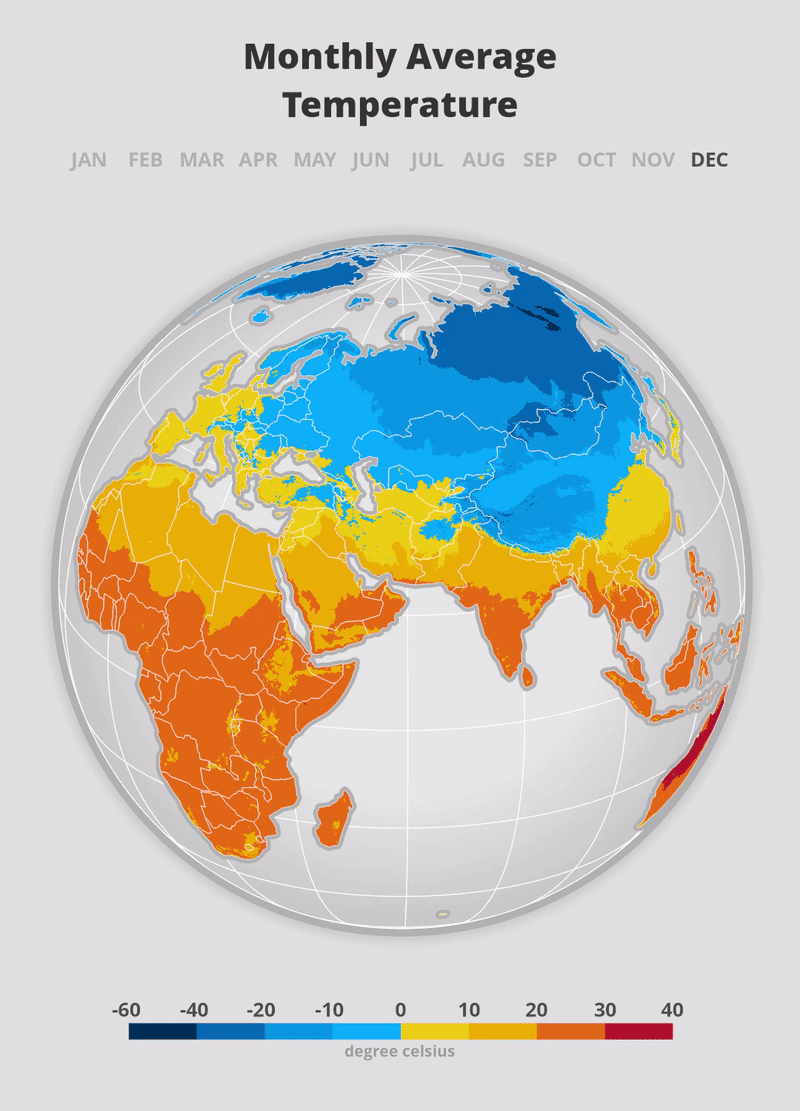
I will go through the process of creating the precipitation map below – the animation on temperature was created using a very similar workflow.

I. Data
I am using freely available datasets for the creation of these animations.
- Climate raster data from worldclim.org. Specifically the mean precipitation dataset with 30 seconds resolution. It includes 12 rasters – one for each month of the year.
- To provide spatial context to the raster data in my map I am using several vector datasets from Natural Earth: Countries, Ocean, Land, Geographic Lines and Graticules
II. Map Setup
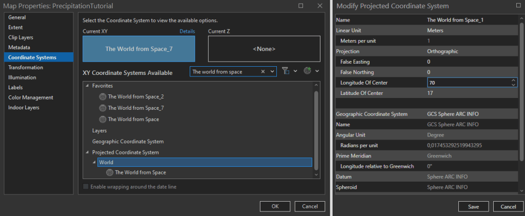
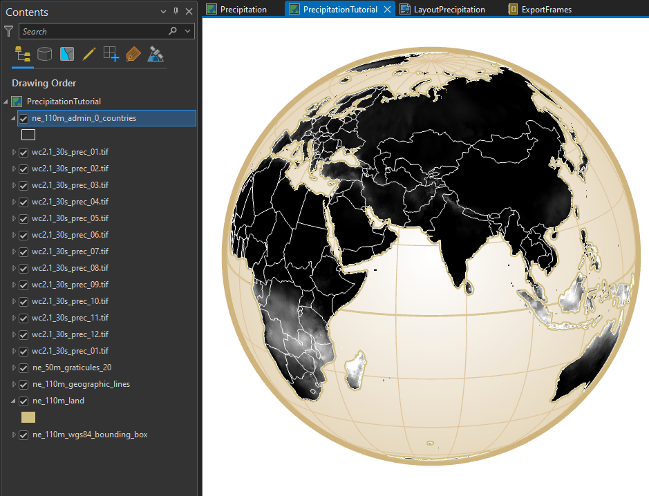
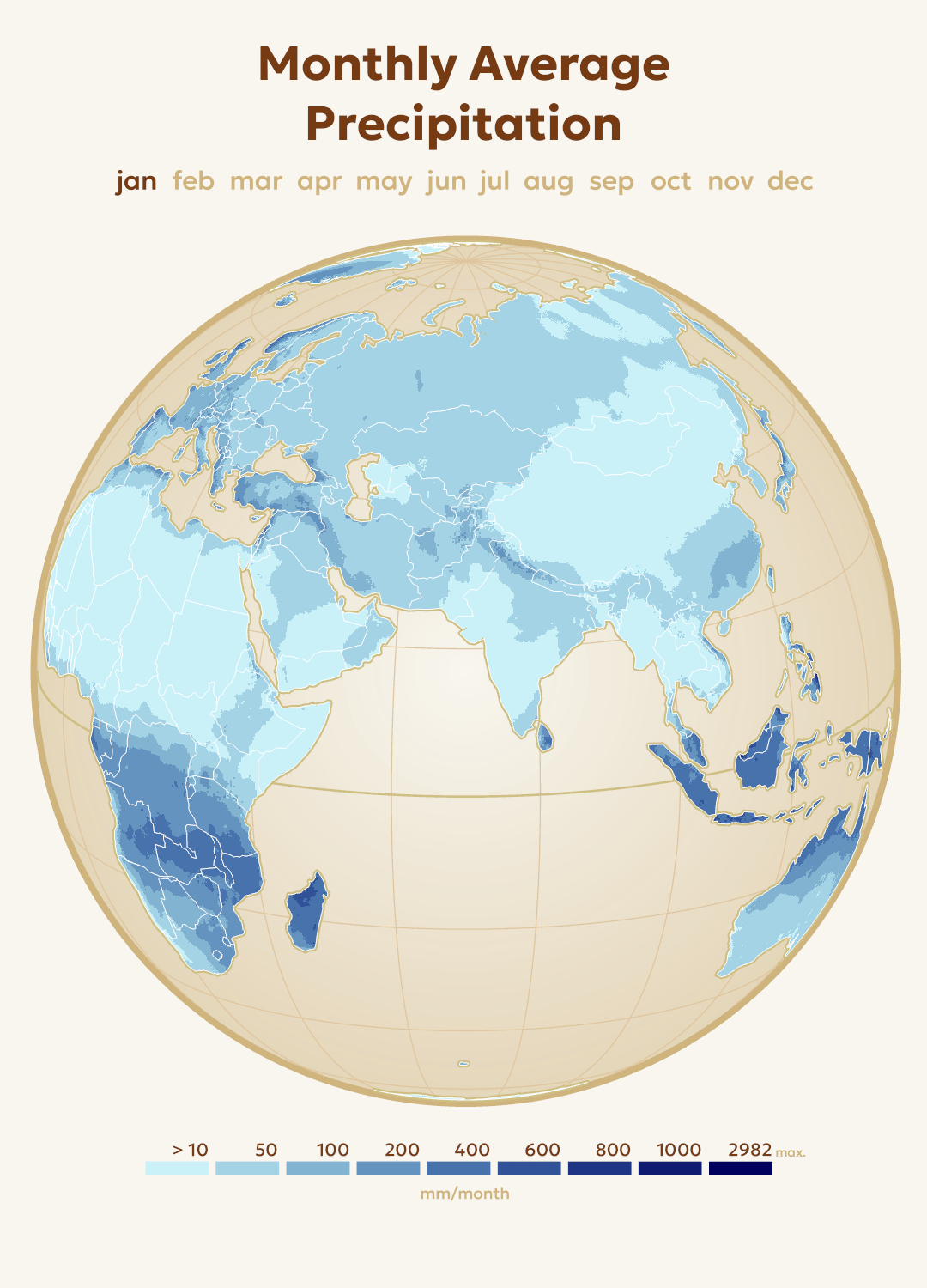
For my animation I am choosing the projection The World from Space (WKID 102038) as it makes the map look like it is on a globe by simulating the curvature of the Earth. Furthermore, I am modifying this projection to fit my desired area of the globe – the Eastern Hemisphere. To accomplish this, I am specifying the Longitude of Center as 70 degrees and the Latitude of Center as 17 degrees in the coordinate system properties.
Next, I am adding the aforementioned vector datasets (countries, graticules, land area) to provide more spatial context to the map, to enhance the 3-dimensional effect of the fake globe, and lastly to stylize the map.
I am adding a subtle circular gradient effect to the globe background to emphasize the 3D effect. I am also increasing the width of the equator line to make it stand out from the rest of the grid lines, since the precipitation shifts above and below this line. For this particular map I decided for a vintage look by using khaki hues.
II. Symbolization of the rasters
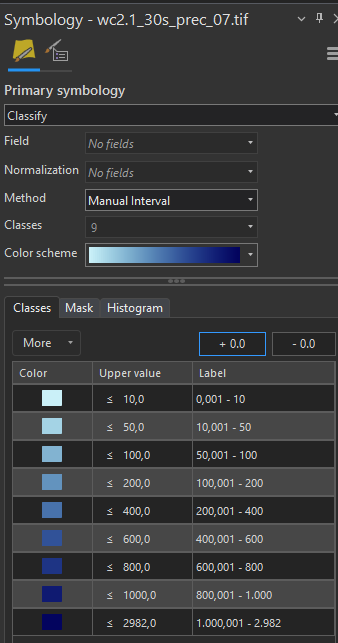
In a time series animation, it is important to make sure the color ramp of all map frames are identical. This means that a universal color ramp must be created that includes the overall maximum and minimum raster values, rather than individual values for each image.
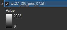
For this dataset, I can simply look at the layer legends in the ArcGIS Pro contents pane to determine the highest value found across all layers. Here, the raster for the month of July contains the highest pixel value of 2982 millimeters in a month – and naturally 0 as the absolute minimum.
I choose to use the Classify symbology method in ArcGIS Pro because it allows me to group pixels in classes with custom value ranges. With this method, I can easily create somewhat algorithmic color classes – meaning that at low values the class ranges are close together, while the class ranges get larger and larger at high precipitation values.
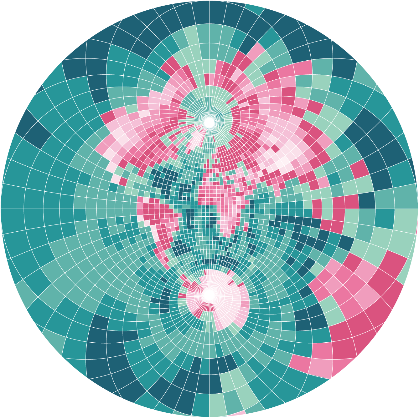
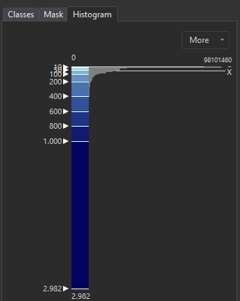
The histogram below shows that the values of the raster are distributed very unevenly. There is a great proportion of pixels with values between 0 and 400, but after that only few pixels have higher values. To visualize both (the small differences at the lower end of the scale and at the same time the outliers) I am defining classes with increasingly wider value ranges.
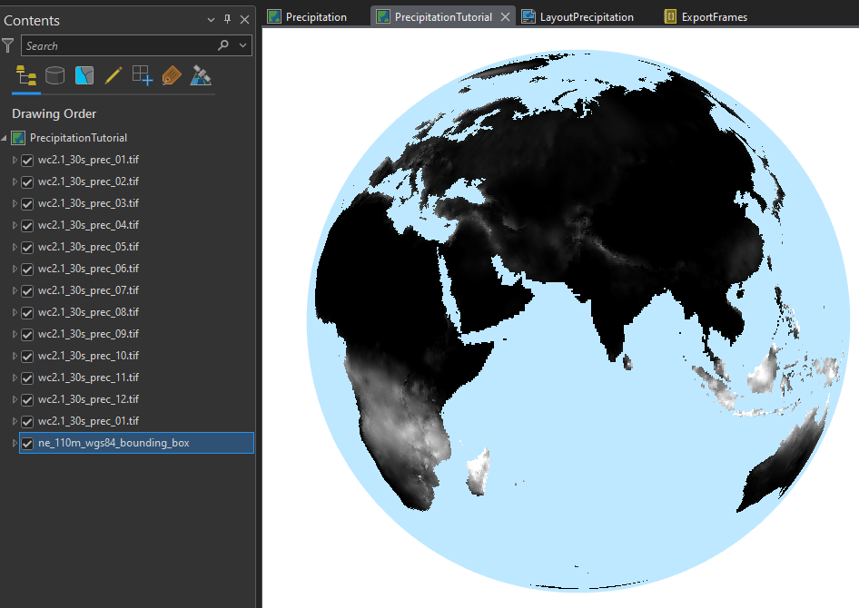
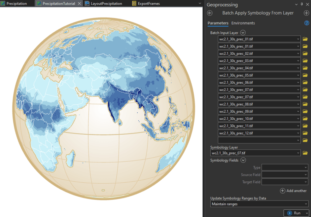
Next, I am using the geoprocessing tool Apply Symbology from Layer in batch mode to assign the symbology to the all of the remaining raster layers.
At this point I have twelve individual raster layers that can be strung together to play as a continuous animation.
III. Create animation frames
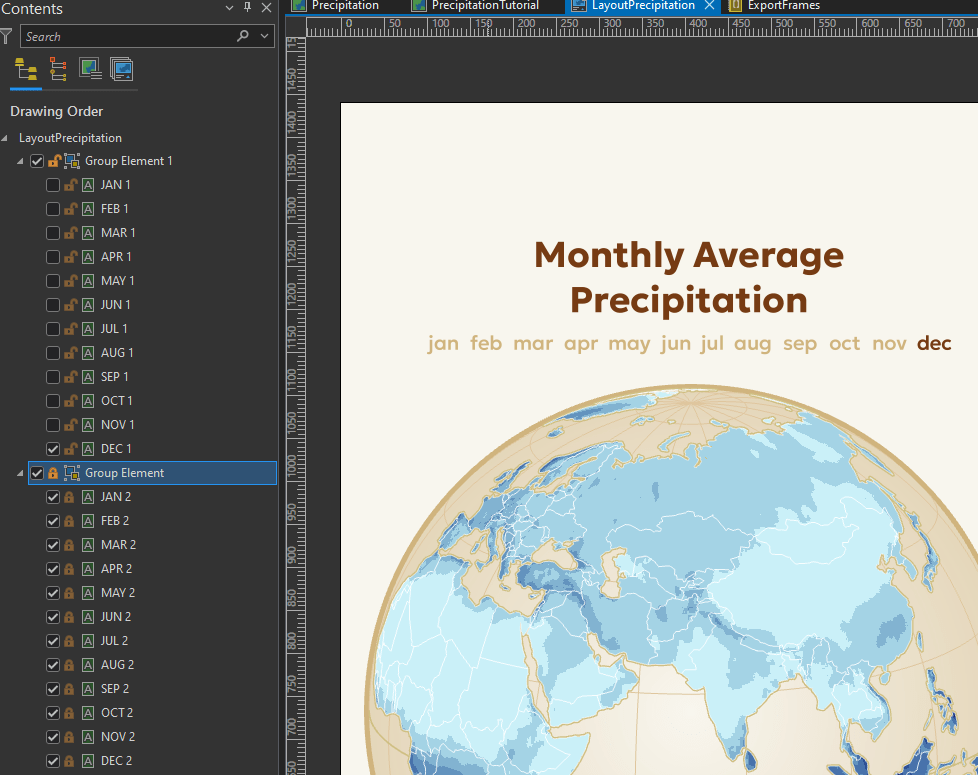
The layout of the map and therefore the layout of the animation does contain the basic elements of a thematic map: title and legend. In addition, I am adding a timeline by using text elements of the twelve months which are changed in style to indicate the current month.
The text elements of the months are individual text blocks. I am grouping the elements and duplicate them on top of each other. Next, I am adjusting the font color of the text element group on top. This allows me to simply switch the visibility of the upper text elements on and off for each animation frame to change the higlighted month.
Using this technique, it is possible to iterate though the elements via a python script to automate the export process. This is because with arcpy.mp the object TextElement currently only provide access to the text string and font size – not the font color. However, toggling the visibility of elements is possible.
At this point, one could just manually export this layout twelve times and each time showing only one of the raster layers and the corresponding text indicating the current month.
However, because I went over many iterations to optimize the animations I wrote the following python script to automate the export process. All the script is doing is to loop through the map and layout elements and toggle the visibility of one of the raster layers and one of the text objects of the current month. In the end the script is writing PNG images of the animation frames to my drive.
#current ArcGIS Project
p = arcpy.mp.ArcGISProject("Current")
#Layout named 'LayoutPrecipitation'
Layout = p.listLayouts("LayoutPrecipitation")[0]


# Define map to work in
m = p.listMaps("Precipitation")[0]
#make list of all layers in map m
lyrList = m.listLayers()
#count the layers
numberoflayers = len(lyrList)

#Loop through the layers
i = 0
while i < numberoflayers:
    # first three layers are vector layers, so start at third element - the first raster layer
    if i > 2 and i < 13:
      #turn off the visibility of previous raster layer
      lyrList[i-1].visible = False
      #turn on the visibility of a specific layer
      lyrList[i].visible = True
      #find current month text element in layout
      a = (i-3)//2
      current_month = Layout.listElements("TEXT_ELEMENT")[a]
      previous_month = Layout.listElements("TEXT_ELEMENT")[a-1]
      current_month.visible = True
      previous_month.visible = False
      #set the output path and file name
      path = "C:\\data\\" + str(i-3) + ".png"
      #Export as PNG
      Layout.exportToPNG(path)
    i += 1
After executing such script (or an manual export) I have twelve frames for my animation. You can now use any software to stitch them together to a movie file or GIF.
You can use free tools like ezgif.com or a professional editing software like Photoshop. I prefer to use After Effects for this final step because it allows me to add advanced animation elements as explained in the last chapter
III. Improving the animation
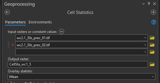
A animation with just twelve frames might turn out very short or can look very choppy if stretched to a longer duration. I am mitigating this problem by calculating intermediate raster images between the available twelve months of data. I am using the ArcGIS Pro tool Cell Statistics to calculate the mean value of two months and use the output as intermediate frames in my animation. This way I am able to double the frames of my animation.
The left animation is based on 24 frames, the animation on the right on just 12:
Lastly, I am using Adobe After Effects to replace the text elements indicating the time for a smoother visual appearance. Instead of a sudden jumps between the months caused by simple images I am using a moving polygon mask in After Effects for a continuous movement of the timeline.


In addition, software like Adobe After Effects provides more control of GIF export settings than the free online tools, like framerate, color depth and resolution.
Thank you for reading. I hope this tutorial proves of use for you!
